Hello Fellow ChartWatchers!
The market moved lower this week, retreating from its failed assault on the highs of last August. Optimists can conclude that more consolidation is needed before the market will be ready to put in new highs. Last week's earnings announcements certainly played a roll as well and more time may be needed to fully digest those. Pessimists will trot out the "O" word - "overbought" - and they are correct - the market is overbought from a purely technical perspectives right now. Add in the fact that we are heading into the summer doldrums - a period with lower volumes (and political conventions) - and things could get very interesting very quickly. I'm more cautious now than I was during our last ChartWatchers webinar, that's for sure.
My New Favorite Page on StockCharts.com!
OK, that's a bit of a fib. Just like a parent with several children, I cannot have a "favorite." But I do have a brand new contender for the title. See if you agree. Here's a screenshot:
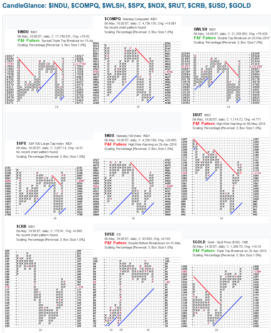 This is our newly updated "Market Overview" index collection displayed in our brand new "P&F Percent" CandleGlance mode. Let me take you through it...
First off, you can see the "big three" market indexes at the top - the Dow Industrials, the Nasdaq Composite, and the Wilshire 5000 (the broadest market index we have). On the next line, we suppliment things with the S&P 500 Large Cap Index, the Nasdaq 100 Index, and the Russell 2000 Small Caps. Those six charts will give anyone a great overall picture of what's happening in the US stock market. Finally, to round things out, we included three non-stock charts - Commodites, the Dollar and Gold. If you study these nine charts on a regular basis, you'll always know where things really are and (hopefully) where they are headed! Just click on the "CandleGlance Groups" link on the right side of our homepage to instantly access this chart collection.
Q: "Hang on Chip - what's with all the X's and O's on your charts above?"
Good point! In the screenshot above, I've shown you the Point & Figure version of that CandleGlance page. To see it, select the "P&F (Percent)" setting from the "Duration" dropdown below the charts.
If you are new to P&F charts, here is a super-short list of things you need to know when looking at them:
- When prices rise significantly, a new column of "Xs" is added to the chart. If prices continue to rise without a significant decline, more Xs are added to the top of the column.
- Similarly, when prices fall, a new column of "Os" is added and, if prices continue to fall, more Os are added to the bottom of the column as needed.
- The chart's volatility (not time) determines how quickly more columns are added to the right edge of the chart.
- The red numbers and letters inside the chart represent the start of a new month.
- Trendlines are always drawn at 45 degrees.
- P&F Patterns are objectively defined (no guesswork) and therefore can be automatically detected.
So, when evalutating a P&F chart, there are a couple of things to look for:
- Is the final column a rising column of Xs (bullish) or a falling column of Os (bearish)?
- Is the most recent trendline rising (bullish) or falling (bearish)?
- Is the most recent P&F pattern green (bullish) or red (bearish)?
- Is the current price marker ("<<") pointing at the very top or very bottom of the current column? If so, that column will probably continue to expand (i.e. the current trend will continue).
There are more, but those are some of the more important basics to focus on.
(For the P&F Geeks out there, I'm also using the new "Percent" scaling option for these CandleGlance charts. It makes each box on the chart represent a 1% move. This works much better for comparing different charts - which is exactly what you do with CandleGlance. We really should have added this a long time ago - doh!)
So... given all that. What does my new favorite page say about the markets right now?
- The Dow is still in breakout mode (a tall rising column of Xs), but could reverse into a falling column of Os if it falls below 17,730.
- The broad Wilshire index is also in a tall rising column of Xs and also is close to its reversal point (21,207).
- Both the Dow and the Wilshire have bullish patterns on their charts (for now).
- ALL of the other stock indexes have already reversed into a falling column of Os with the Nasdaq 100 and Russell 2000 also having bearish P&F patterns.
- While all of the stock indexes have uptrend lines on their charts, those trendlines are still well below the current price action.
- The Dollar has just broken down below a key support level at 94 and may test its uptrend line soon.
- Gold is looking pretty positive with a bullish pattern and a rising column of Xs.
- (I'll leave Commodities as an exercise for the reader. :-)
Hopefully, you will find this page as useful as I do for getting a mid- to long-term view of the market. Again, simply click "CandleGlance Groups" on the right side of the StockCharts homepage, then select "P&F (Percent)" from the "Duration" dropdown below the charts.
Enjoy!
- Chip
SITE NEWS
RECENT ADDITIONS TO STOCKCHARTS.COM
DON'T FORGET TO REGISTER FOR CHARTCON 2016! In case you missed the announcement, we're holding a virtual (on-line) ChartCon in September. The overall theme of this year's event is "Putting it All Together - Becoming a Systematic Technician." We will have live presentations from John Murphy, Martin Pring, Arthur Hill, Chip Anderson, Erin Heim, Greg Schnell, Gatis Roze, Tom Bowley, Bruce Fraser, Julius deKempenaar and Greg Morris. We are working hard on making this the most interesting and meaningful online event you've ever attended with lots of opportunities for Q&A and interaction with the presenters. Because this is a virtual conference, anyone can "attend" regardless of your location AND the costs are MUCH, MUCH lower! No travel, no hotel, no meals, etc. BUT YOU MUST REGISTER SOON! Space is still limited and the slots are filling up fast. For more details - including dates and prices - please CLICK HERE!
NEW PERFCHART PAGE - We've just rolled out a new design for
our PerfCharts page. Now the chart will automatically re-size to fit your browser window at all times.
HTML5 CHARTNOTES BETA IS WINDING DOWN - Be sure to test out of new HTML5 version of ChartNotes and let us know what you think. We've fixed a bunch of bugs over the past 2 weeks so please make sure that things work well for you. Unfortunately, for security reasons, the Flash version of ChartNotes will be removed from the website soon so help us ensure that the new version does what it needs to do before that happens.
NEW BOOK ALERT! GATIS & GRAYSON ROZE ARE NOW OFFICIALLY "AUTHORS!" - If you read Gatis Roze's "Traders Journal" blog articles (and you should), then you know that he has tons of real-world trading experince to share. Now Gatis and his son, Grayson, have published much of that knowledge in a new book from Wiley -
"Tensile Trading: The 10 Essential Steps to Stock Market Mastery." This is a very important book that all StockCharts users should read - period. Fortunately, we have
signed copies of the book for sale in our bookstore and they are on sale!
Click here to get your copy today!
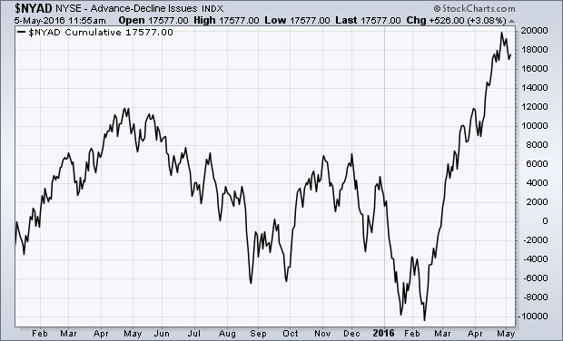
THE TRADITIONAL NYAD LINE HITS NEW RECORD... Chartists look to the NYSE Advance-Decline line to help determine the trend of the stock market. The NYAD line is simply a running cumulative total of the number of advancing stocks minus decliners on the big board. And it has a good track record of leading turns in the stock market itself. Chart 1 shows the traditional version of the NYAD line peaking last May which warned of a market downturn that started last summer and lasted into this year. Chart 1 also shows the advance-decline hitting a record high this spring. That's a very positive sign for the stock market. Not all chartists agree, however, that the line in Chart 1 truly represents the market. That's because it includes a number of issues that aren't true common stocks -- like preferred stocks and entities more closely tied to the bond market. Those chartists believe that a correct version of the advance-decline should include only common stocks.
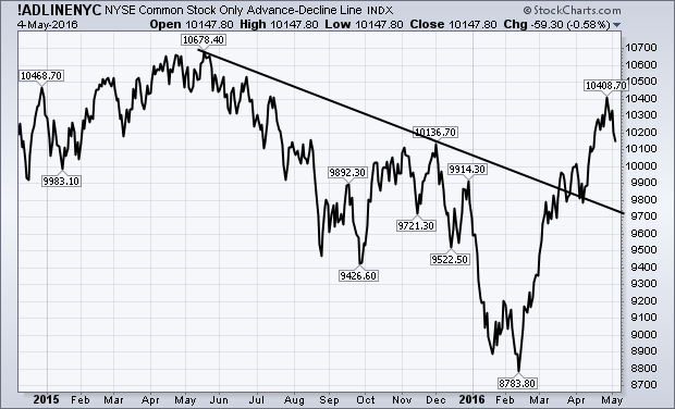
NYSE COMMON STOCK ONLY AD LINE ISN'T AS STRONG... Chart 2 shows the NYSE Common Stock Only (CSO) Advance-Decline line. As the name implies, this version of the AD line includes only common stocks. That version of the line also peaked last May and bottomed during February. It has since then exceeded its fourth quarter high and reached the highest level since last July. What the AD line hasn't done is move above last May's peak to a new record. So it doesn't look as impressive as the more traditional version in Chart 1. Although its intermediate trend is clearly higher, the fact that it hasn't hit a new record leaves in some doubt the issue of whether stock indexes will reach new highs. Historically, however, it should be pointed out that this version of the advance-decline usually lags behind the more traditional version.
 - John
StockCharts members: Click here to see the rest of John's AD comments.
OIL REACHES MOMENT-OF-TRUTH
by Arthur Hill | Art's Charts
Oil remains in an uptrend this year, but the bigger trend remains down and this could be just a counter-trend bounce. The price chart shows the USO Oil Fund (USO) in the top window and June Crude (^CLM16) in the bottom window. I am using June Crude for analysis because it is the pure play on oil.
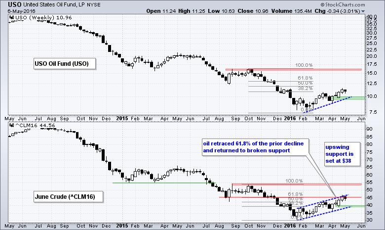
Crude advanced around 50% in four months, but this advance still pales relative to the bigger downtrend and the prior decline. Note that oil fell around 40% from October to January. This down-up sequence highlights an important aspect of trading. Namely, it takes a 100% advance to recover from a 50% decline (i.e. 100 to 50 and back to 100). On the price chart, notice that June Crude is near the 61.8% retracement and broken support. A classic tenet of technical analysis is that broken support turns into subsequent resistance. The 61.8% retracement is a Fibonacci level that marks a potential reversal zone. Taken together, this suggests that further upside could be limited.
Despite potential resistance and a possible reversal zone, crude is not showing any weakness just yet and the immediate trend is clear up. The blue channel lines define the 2016 uptrend with support marked at $38. Even though this could be a counter-trend rally, this medium-term trend appears to be the dominant force right now so we need to wait for some sort of bearish indication, such as an outside reversal week.
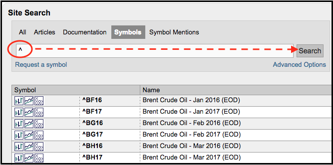
Looking for more futures symbols at StockCharts? Simply search the symbol catalog for a caret (^). All futures symbols are updated after the close and begin with a caret.
Follow me on Twitter @arthurhill - Keep up with my 140 character commentaries.
****************************************
Thanks for tuning in and have a good weekend!
--Arthur Hill CMT
Plan your Trade and Trade your Plan
*****************************************
Entertainment is all about watching something exciting.
With all the discussion of cord cutting for cable, multiple companies have discussed that they expect to make more money through direct subscription or skinny bundles. While it is still early to know, this is a hot area to watch. Scripps has a lot of the Home & Garden shows and the Scripps SCTR (not shown) is just moving above 75. Time Warner Cable has moved to a multi-platform distribution model which is an important area for all the cable companies. It also has an SCTR just moving above 75 late last month.
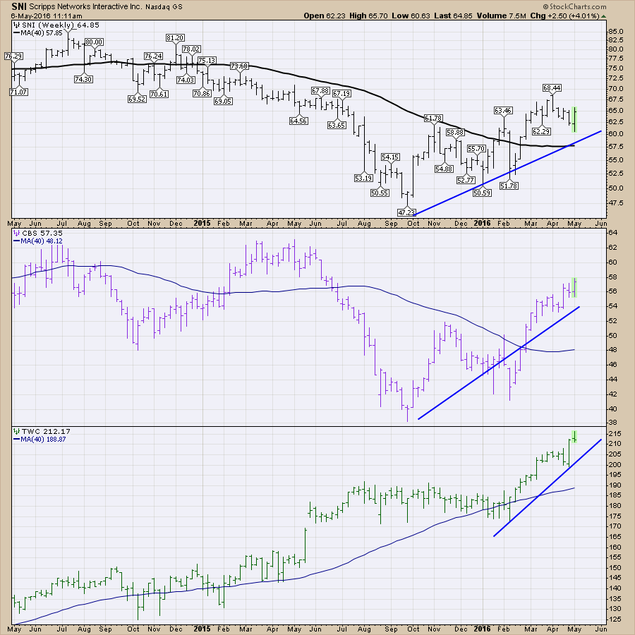
The group is looking very positive as there are a lot of companies with an SCTR above my magic line of 75%. Additionally, the breadth above 50% is very bullish. Look at the three-month % change. Very few companies have underperformed the SPY which is up 9% in three months.
 Disney (DIS). After a tremendous 2015, Disney paused (30%!) recently on a fade in subscriptions. Disney just moved above its 200 Day Moving Average (200 DMA) and the SCTR has popped up above 50.
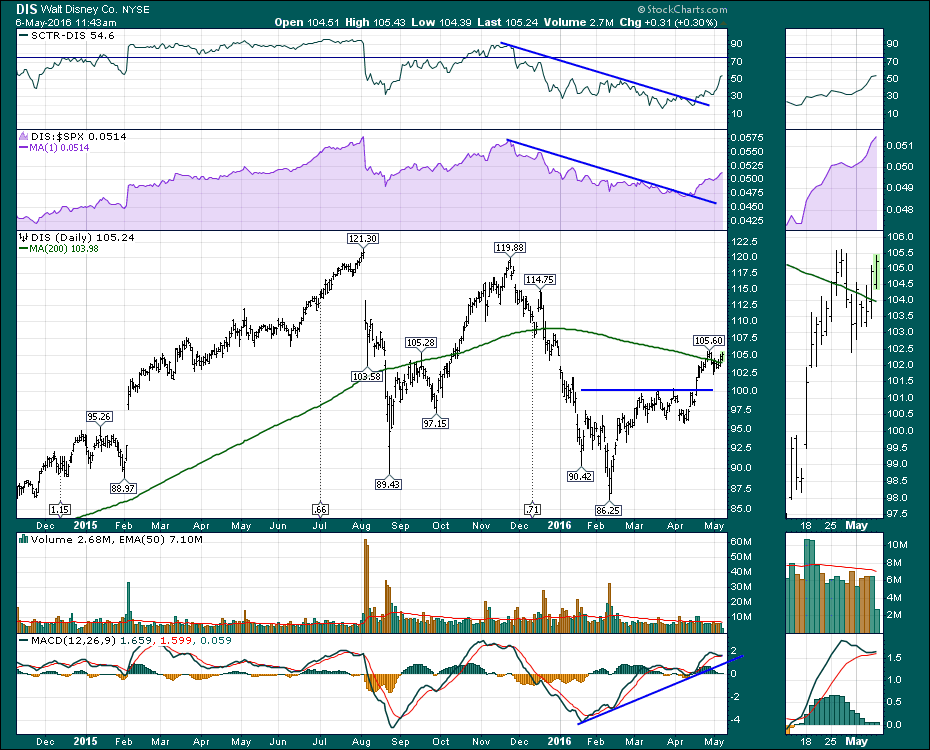 This industry group looks like a strong investment theme as these charts have pulled back very little while the $SPX is making lower lows for the last few weeks. Perhaps this group will get you entertained and prosperous with some of the outsized gains and the general acceleration in the area.
For more ideas, check my blogs and subscribe for email delivery by clicking on the Yes button below the article within each blog. The Canadian Technician and The Commodities Countdown have exclusive content using my style of analysis. As I flit around between charts, I often post on Twitter as well. @Schnellinvestor. Follow me there for lots of charts that don't make it into an article.
Good trading,
Greg Schnell, CMT, MFTA.
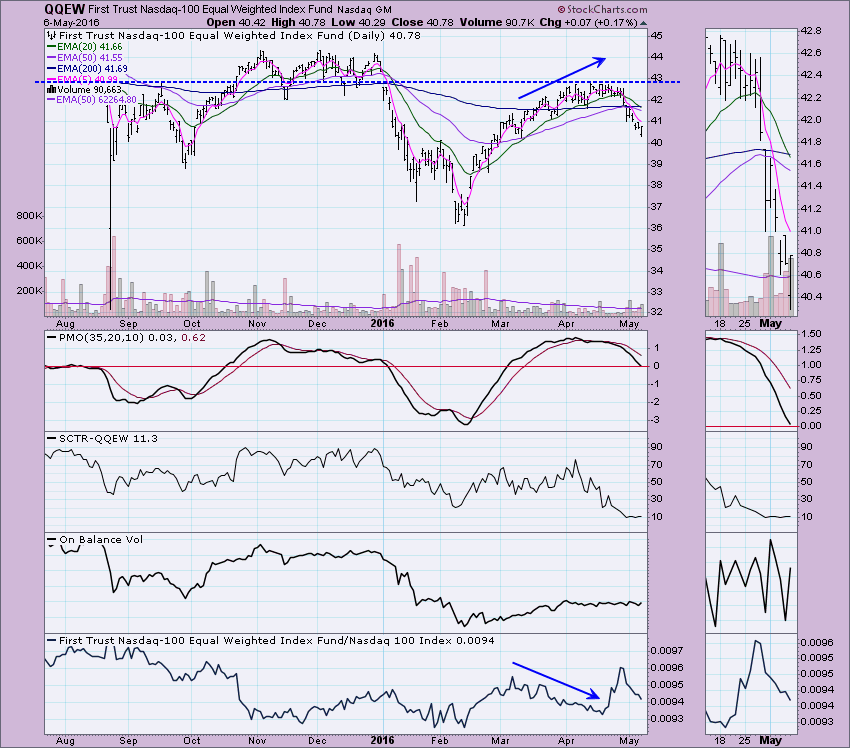
As I reviewed the charts of the Nasdaq 100 with my viewers during webinar today, I started to wonder how the equal-weight version was stacking up against the NDX ETF (QQQ). Typically the equal-weight versions do better over time than their cap-weighted counterparts. (Carl wrote an excellent article on this that you can read here.) However, they aren't right now.
Let's start with the QQQ. It is a bearish chart, to be sure, but notice that the 50-EMA crossed above the 200-EMA back in early April and consequently the upcoming new 20/50-EMA negative crossover will occur above the 200-EMA. That would trigger an Intermediate-Term Trend Model (ITTM) Neutral signal.
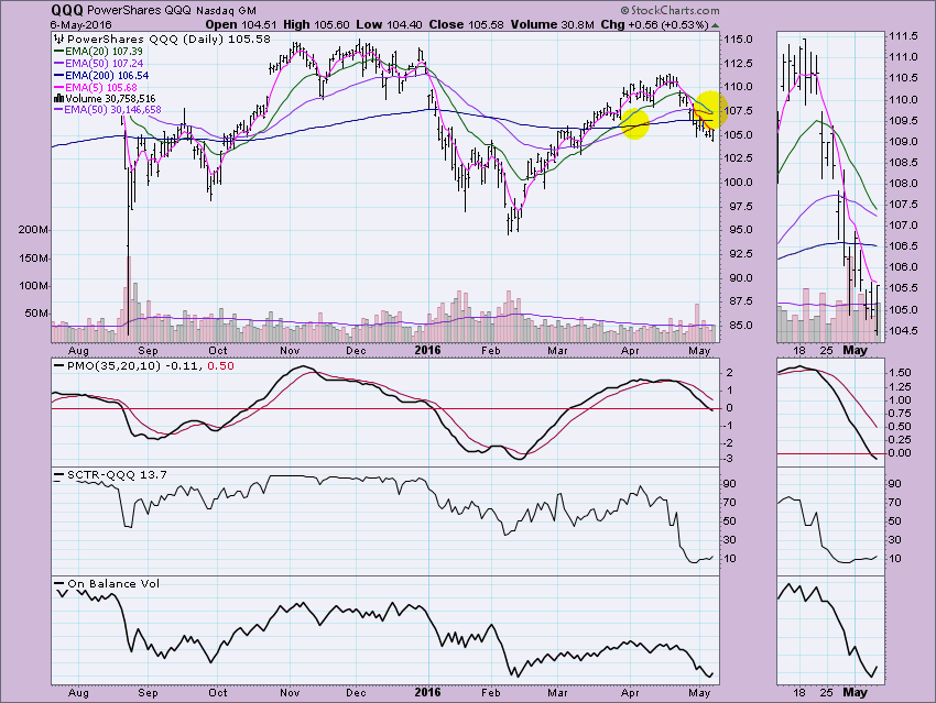
A comparison to the QQEW displays a bear market configuration with the 50-EMA below the 200-EMA; in fact, it missed out on the 50/200-EMA positive crossover altogether. A negative 20/50-EMA crossover would align the ITTM to a SELL, not Neutral, signal. Notice that in the last rally, relative strength declined. In a healthy rally, equal-weight ETFs should outperform. As prices topped, QQEW gained some strength. Smaller caps held on to the top as the large caps accelerated lower. Next time, we need to see QQEW gaining relative strength throughout the rally. Smaller caps need to contribute and large caps need to not poison the well.
Come check out the DecisionPoint Report with Erin Heim on Wednesdays and Fridays at 7:00p EST, a fast-paced 30-minute review of the current markets mid-week and week-end. The archives and registration links are on the Homepage under “What’s New”.
Technical Analysis is a windsock, not a crystal ball.
Happy Charting!
- Erin
2016 has been a very good year thus far for the energy sector (XLE) as it's gained 17.51% in just the last three months alone. Unlike many of the other sectors that have been battling slowing momentum in the form of negative divergences, momentum remains very strong for the XLE on the daily chart. Check out the three month chart:
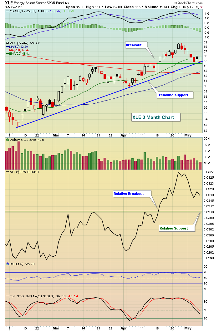 In addition to recently breaking out on an absolute basis, energy has been performing exceptionally well relative to the S&P 500 where we've also seen a breakout. The recent selling likely is providing a late entry into this sector for those who have missed the initial move. I'd be careful if the 64.50-65.00 area fails to hold as support, though, as it's been a very critical pivot area over the intermediate-term. Here's a chart of the XLE over the past couple years:
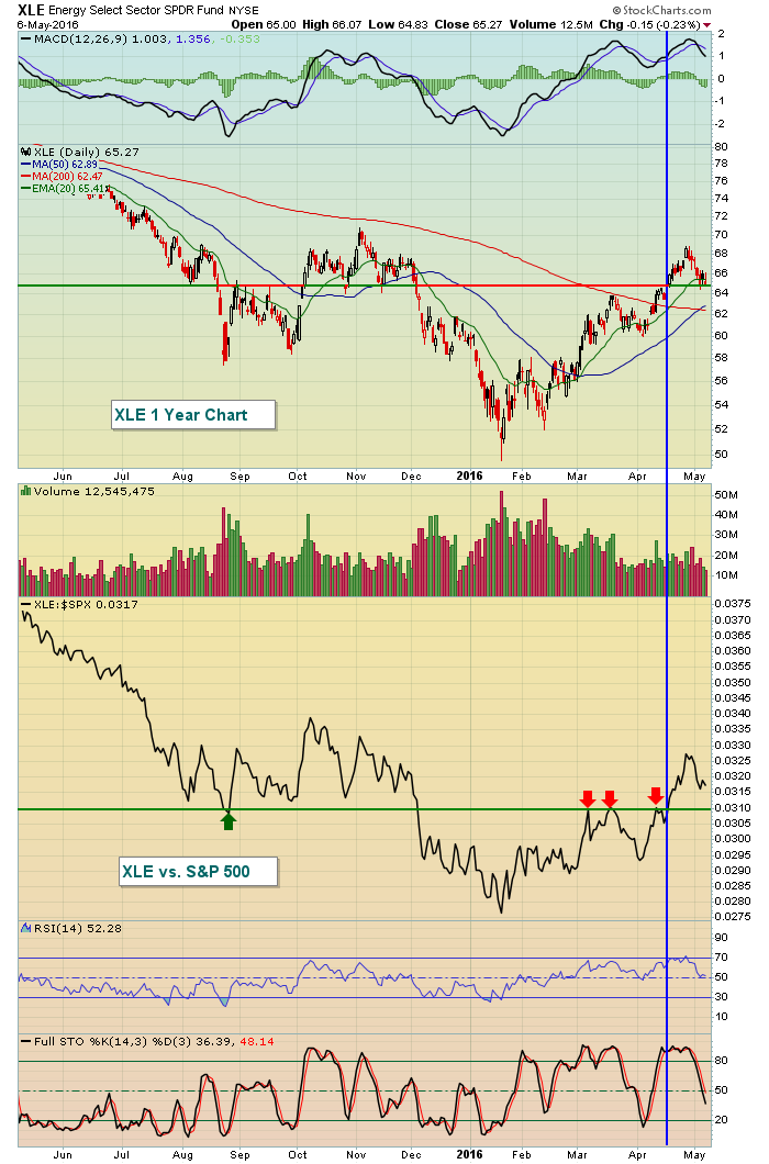 The blue vertical line marks both the absolute and relative breakouts. The horizontal line on the price chart shows that 64.50-65.00 has provided both excellent support and resistance over the past year, so it's important for the bulls to support the XLE at that level and so far they have.
I would continue to look for leadership from energy until both price and relative support are lost.
Happy trading!
Tom
TRADING TUNE UP - LESSONS LEARNED
by John Hopkins | InvestEd Central
If you've been trading for a decent period of time you know how quickly things can turn against you. Sometimes with no warning, all of the good work you've done seems to disappear and before you know it, profits quickly disappear as well.
As a trader for many years I have experienced the same thing. But each time I stumble I step back and try to figure out what I might have done differently to change the outcome and I have found that I always learn from my mistakes.
For example, from time to time I will trade Leveraged ETF's in a particular sector that I think is extremely overbought or oversold. This allows for the possibility of a substantial gain in a short period of time. However, I learned the hard way when the market was under fire early in the year- let's say I let my guard down - that these ETF's really aren't meant to be held for long periods because they can deteriorate dramatically over time. Plus, if the trade doesn't go the way you think it will, the losses can mount quickly, putting a serious dent in the pocketbook.
Here's another example, one that I know even the most experienced trader falls trap to. It happens when you buy a stock for a trade and set a specific stop loss in case the trade goes against you. It's a requisite to trading. But sure enough, when the stock falls through the stop loss, you simply ignore it, thinking it will reverse in your favor, and when it doesn't, your losses continues to grow.
Here's a great example that has to do with earnings season; holding a stock into its earnings report. Some traders like to do this to feel the "thrill" that comes if the stock soars after it reports its numbers. But what if the opposite happens, and the stock gets clobbered? Just look at the chart below on FireEye, a company that reported its earnings this past Thursday, and ask yourself how you would feel if you held a substantial position in this stock when it reported its numbers:
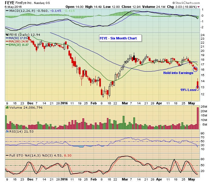 The point is this. Trading successfully takes a lot of hard work. And it requires you to brush up from time to time, what I call a "Trading Tune Up" in order to stop making the same mistakes. In fact, I am considering conducting a Trading Tune Up webinar sometime in the next few weeks, depending on the level of interest. Accordingly, you can click here if you are interested and want to learn more.
We're all going to make mistakes when we trade; it's part of the risk of being involved in the stock market. But when it becomes more regular than from time to time, you've got to look at making some serious adjustments.
At your service,
John Hopkins
EarningsBeats.com
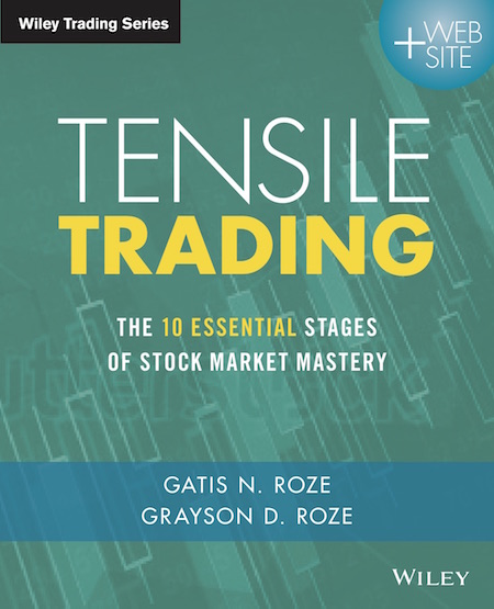
The legendary Warren Buffet once said, "You only have to do a few things right in your life so long as you don't do too many things wrong." Co-authoring an investment book alongside my son, Grayson Roze, stands out as one of the most profoundly "right" things I've done in my professional life. After two years in the making, it is with tremendous pride and boundless excitement that I...
Read More This is our newly updated "Market Overview" index collection displayed in our brand new "P&F Percent" CandleGlance mode. Let me take you through it...


 - John


 Disney (DIS). After a tremendous 2015, Disney paused (30%!) recently on a fade in subscriptions. Disney just moved above its 200 Day Moving Average (200 DMA) and the SCTR has popped up above 50.


 The legendary Warren Buffet once said, "You only have to do a few things right in your life so long as you don't do too many things wrong." Co-authoring an investment book alongside my son, Grayson Roze, stands out as one of the most profoundly "right" things I've done in my professional life. After two years in the making, it is with tremendous pride and boundless excitement that I...