Don't Ignore This Chart!April 16, 2009 at 08:25 PM
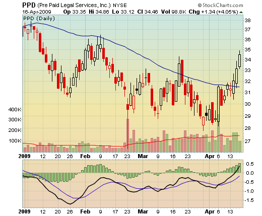
Click here for a live version of this chart. We discussed PPD and its long struggle with the 50-day MA in a previous post...Read More
Don't Ignore This Chart!April 16, 2009 at 01:49 PM
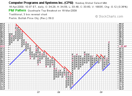
Click here for a live version of this chart CPSI has had a pretty impressive P&F chart for a while now. On March 16th, it completed a Quadrupal Top Breakout pattern that is, technically, still in place today...Read More
Don't Ignore This Chart!April 09, 2009 at 01:27 PM
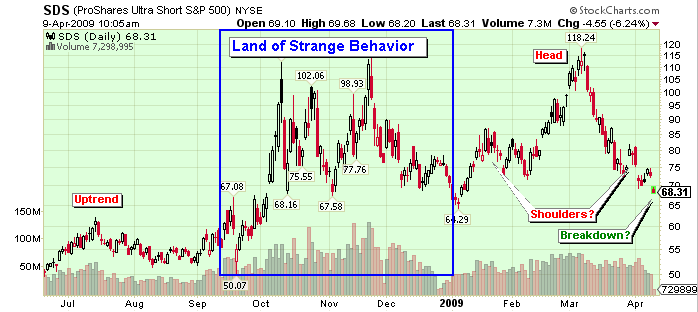
Click here for a live version of this chart SDS is the ProShares Ultra Short S&P 500 ETF. It's a way to invest (gamble really) that the market is going to fall. It showed up today on our Ticker Cloud page as one of today's most popular charts. A close look at the chart shows why...Read More
Don't Ignore This Chart!April 07, 2009 at 03:24 PM
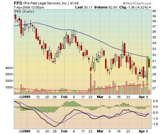
Click here for a live version of this chart Help! Police! Pre-Paid Legal Services (PPD) is getting beat down by its 50-day Moving Average! Again! This is the third time this year that PPD has failed to penetrate the 50-day MA (blue line)...Read More
Don't Ignore This Chart!April 03, 2009 at 07:12 PM
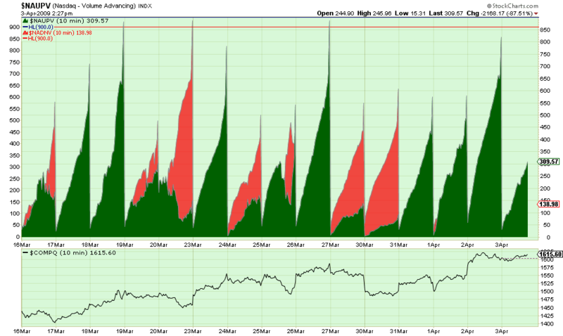
Click here for a live version of this chart. "Wow. That doesn't look like any financial chart I've ever seen before." I agree, that is one strange looking chart. What the green area shows is the total amount of "Up" volume - i.e...Read More
Don't Ignore This Chart!March 27, 2009 at 05:50 PM
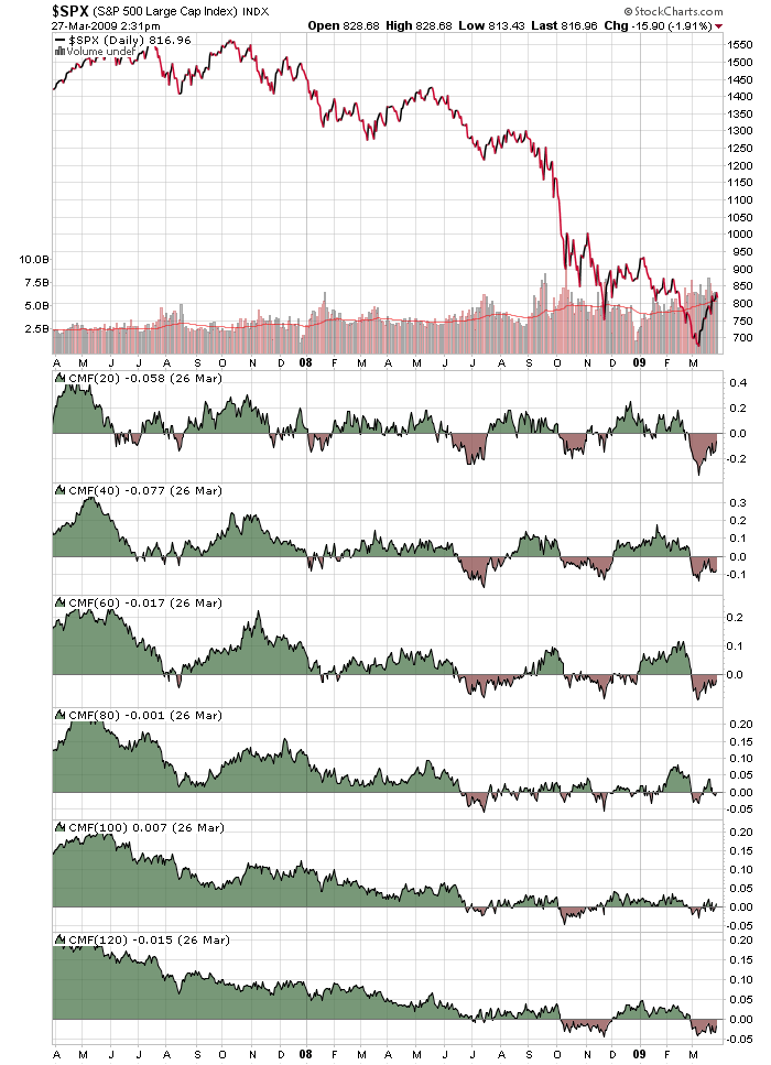
Click here for a live version of this chart. Often we get asked "What settings should I use on my indicators? What's the best?" and our answer is the always infuriating "It depends." The chart above shows why "It depends" is always going to be our answer...Read More
Don't Ignore This Chart!March 25, 2009 at 02:01 AM
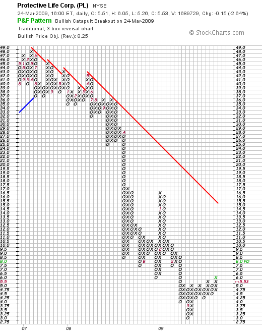
Click here for a live version of this chart. The "Bullish Catapult" P&F pattern is a great way to find stocks that are breaking out above resistance. Today, Protective Life Corp. (PL) was the only high volume stock to create a new Bullish Catapult pattern when it moved above 6.0...Read More
Don't Ignore This Chart!March 20, 2009 at 10:26 PM
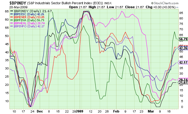
Click here for a live version of this chart. Click here for a live version of this chart. Bullish Percent indexes show the percentage of stocks in a given group that have a "Buy Signal" on their P&F chart...Read More
Don't Ignore This Chart!March 19, 2009 at 07:59 PM
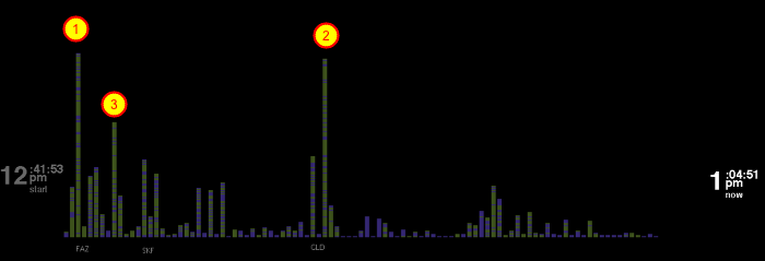
Click here to start watching Ticker Rain This is not your typical stock chart. This is what you see after running our Ticker Rain program for a while. It can show you what tickers are popular on StockCharts.com. More importantly, it can show you what everyone else is looking at...Read More
Don't Ignore This Chart!March 18, 2009 at 09:32 PM
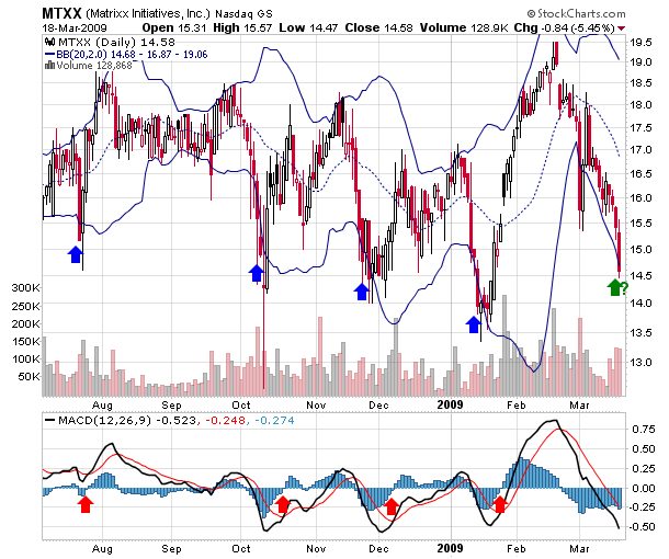
Click here for a live version of this chart How are your money management skills these days? Here's a real test for you: Over the past 10 months, MTXX has been bouncing up and down between roughly 14 and 19...Read More