MailBag May 08, 2015 at 05:28 AM
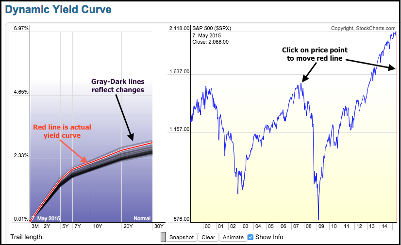
The yield curve is in the spotlight over the last few weeks as the 10-YR Treasury Yield ($TNX) surged back above 2%. Chartists can plot the yield curve on a SharpChart or with the Dynamic Yield Curve tool. The image below shows the Dynamic Yield Curve on the left and the S&P 500 on the right. The vertical red line on the S&P 500 chart marks the date for the current yield curve, which is shown as the red line on the left. Chartists can click on the S&P 500 chart to move the red line and see what the yield curve looked like at different price points (2007 high or 2002 low). The Read More
MailBag May 01, 2015 at 05:27 AM
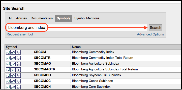
StockCharts carries several commodity symbols from Bloomberg that chartists can use to track individual commodities and commodity groups. These can be found by searching the symbol catalog for "Bloomberg and index" (without quotation marks). The image below shows a sampling of these symbols. The list starts with the Bloomberg Commodity Index, which consists of six commodity groups and twenty-one different commodities. This is the Bloomberg equivalent of the CRB Index ($CRB). Before looking at the components, note that symbols ending with "TR" represent a "total Read More
MailBag April 24, 2015 at 08:03 AM
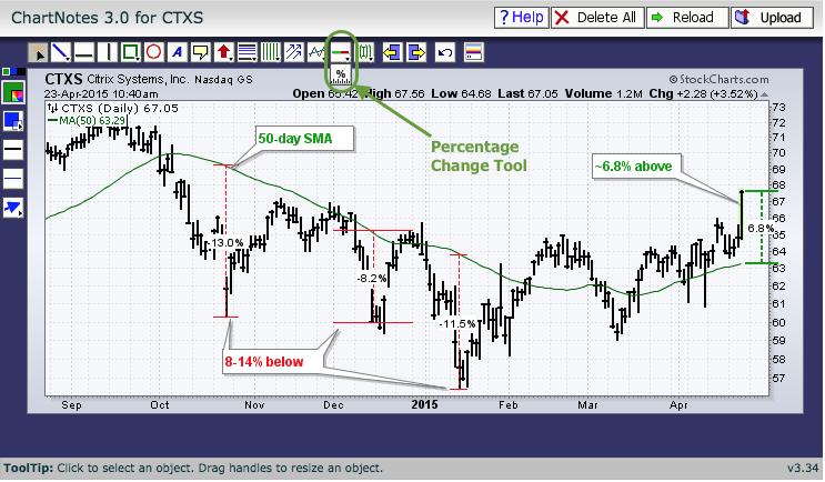
Chartists can measure the difference between price and a moving average using the Percent Change Tool and the Percentage Price Oscillator (PPO). Knowing how far above or below a stock is from its moving average can help determine if it is overextended or if momentum is accelerating. Let's look at a 50-day simple moving average using Citrix as an example. The Percent Change Tool can be found when annotating a SharpChart. The icon is in the middle of the top row under the auto support-resistance icon (green-red line). Click, drag and extend this tool to measure the difference Read More
MailBag April 10, 2015 at 04:26 AM
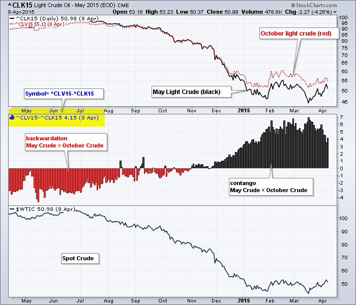
While we cannot plot the complete shape of the futures curve, chartists can plot the difference between near-term futures prices and forward futures prices to find out if market structure is in contango or backwardation. This is important to markets like oil because market structure reflects current and future demand prospects. In general, market structure is contango when near-term futures prices are lower than the more distant futures prices. For example, contango would be present if May Light Crude (^CLK15) was priced below October Light Crude (^CLK15). Backwardation Read More
MailBag April 07, 2015 at 08:48 PM
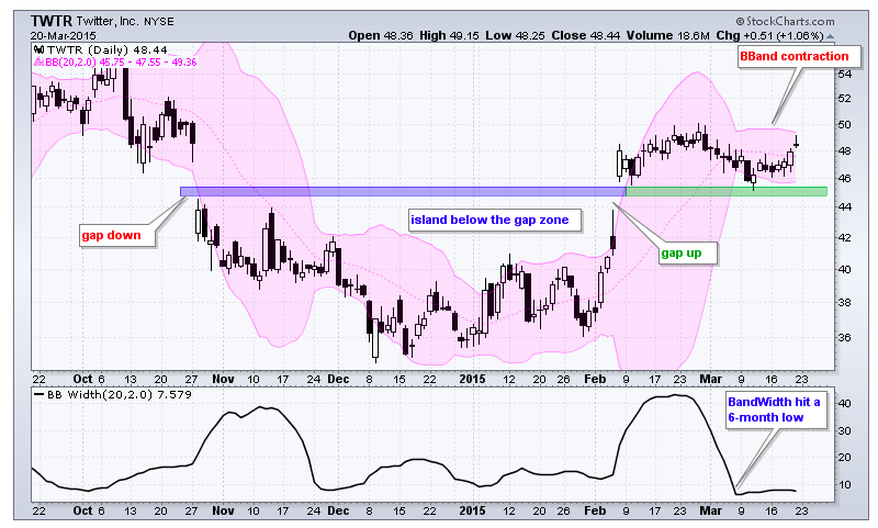
There is an interesting little technique that can help you save a writer's annotations when you save the chart into your own ChartList. Here is how I do it. In the Don't Ignore This Chart article from last week, Arthur highlighted some simple support / resistance areas. Here is the chart. Now, if you wanted to save that chart without Arthur's annotations, just click on it and use the save menu at the top centre of the chart. You can see I used the Save As tool. This will erase the annotations though. To keep Read More
MailBag April 03, 2015 at 02:52 PM
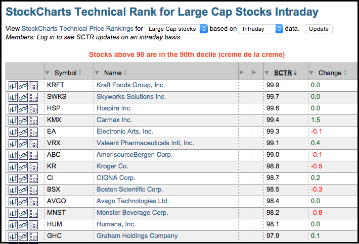
There are several ways chartists can use the StockCharts Technical Rank (SCTR) to find winning stocks and ETFs. First, note that we have SCTRs for US large-caps, US mid-caps, US small-caps, Toronto stocks and ETFs. Leveraged and inverse ETFs are excluded from the ETF group. The securities in each group are ranked against each other. The rankings, therefore, do not overlap and are not comparable outside the group. The SCTRs in each group range from zero to one hundred. Using large-caps as an example, stocks scoring between zero and ten would be in the bottom Read More
MailBag March 28, 2015 at 09:41 AM
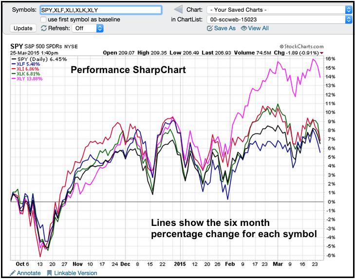
Chartists can show the performance for several symbols on one SharpChart by entering a comma-separated list (spy,xly,xlk,xli,xlf). Note that free users can chart up to five symbols on one chart, Basic and Extra members can chart up to six symbols and Pro members can chart up to ten symbols. Click here to see the different subscription packages. Simply enter these symbols in the symbol entry box and click go to create a performance SharpChart. The example below shows the performance for SPY and four sector SPDRs over the last six months. All five are up, but one Read More
MailBag March 20, 2015 at 07:26 AM
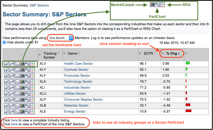
The Sector Summary page is designed to help chartists find the best performing sectors, industry groups and stocks. Using a top-down approach, users start with the sectors to see a break down of the broader market. Click on a sector to see the industry groups in that sector and click on the industry group to see the stocks in that group. Chartists can also adjust the timeframe, sort the various columns, apply PerfCharts, use MarketCarpets and use some symbol groups in a Relative Rotation Graph (RRG). The example below shows the landing page for the Read More
MailBag March 13, 2015 at 05:25 AM
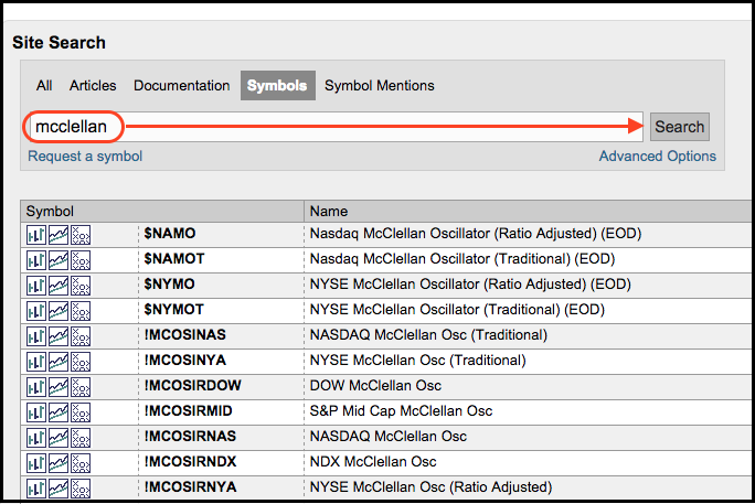
There is a little indicator "hack" that chartists can use to update the McClellan Oscillator during the day. First, note that StockCharts has end-of-day (EOD) symbols for the McClellan Oscillators. Simply search for the term "mcclellan" in the symbol catalog. The symbols beginning with an exclamation point (!) come from the DecisionPoint merger and these indicators are also updated after the close. The ratio-adjusted McClellan Oscillator uses the ratio of net advances [(advances less declines) divided by total issues]. The traditional McClellan Oscillator simply uses net advances Read More
MailBag March 06, 2015 at 08:01 AM
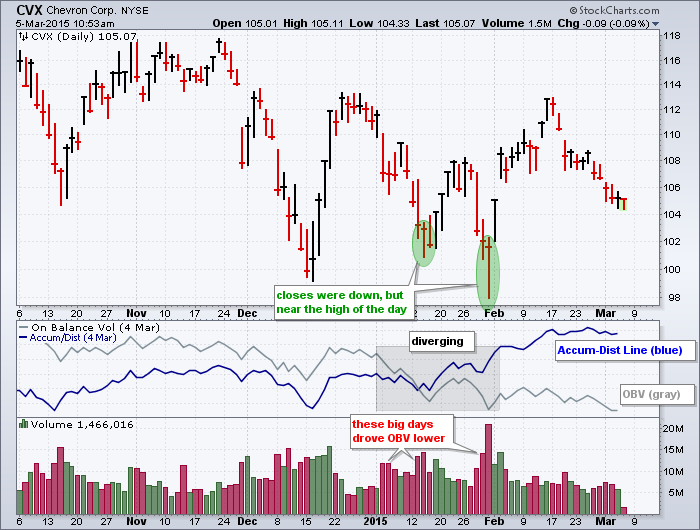
It does not always happen, but sometimes On Balance Volume (OBV) and the Accumulation Distribution Line (ACDL) diverge to paint completely different pictures. These two can diverge because they are calculated differently. First, note that both indicators use price and volume to detect accumulation and distribution. OBV, which was developed by Joe Granville, rises when the close is higher than the prior close and declines when the close is lower. On a daily chart, the period's volume is added on an up day and subtracted on a down day. Down days on big volume, therefore, will push the Read More