ANSWERING OUR TOP TWO QUESTIONS
by Chip Anderson | ChartWatchers
Hello Fellow ChartWatchers!
Friday's rally changed last week's Dow candlestick from a big filled candle into more of a big Hammer (although not a perfect one). After Friday's rally, the Dow finished the week down 1% as did the S&P 500 Large Caps. The big winner for the week was the Russell 2000 which was up over 2.75%(!). For more on this and the longer-term meaning of these moves, check out what John, Art, Greg, Carl and Tom have to say below.
I'm going to spend some time today answering the two most common questions people ask us during our very successful weekly webinars.
Answering Our Top Two Questions
Q1: How do I put two different ticker symbols on the same chart?
A1: Members can add up to 5 additional ticker symbols to a single SharpChart by using the "Price" indicator. (Non-member can add up to three.) Like its name implies, the "Price" indicator displays the price data for whatever ticker symbol you give it. You add the Price indicator using the dropdowns in the "Indicators" area underneath your chart. These are the same dropdowns that contain other technical indicators like MACD and RSI. Just open up one of the free dropdowns and select "Price". Next, change the Parameter box so that instead of "$SPX", it contains the ticker symbol that you want to chart. Finally press the "Update" button to see the new version of your chart. Here's an example:
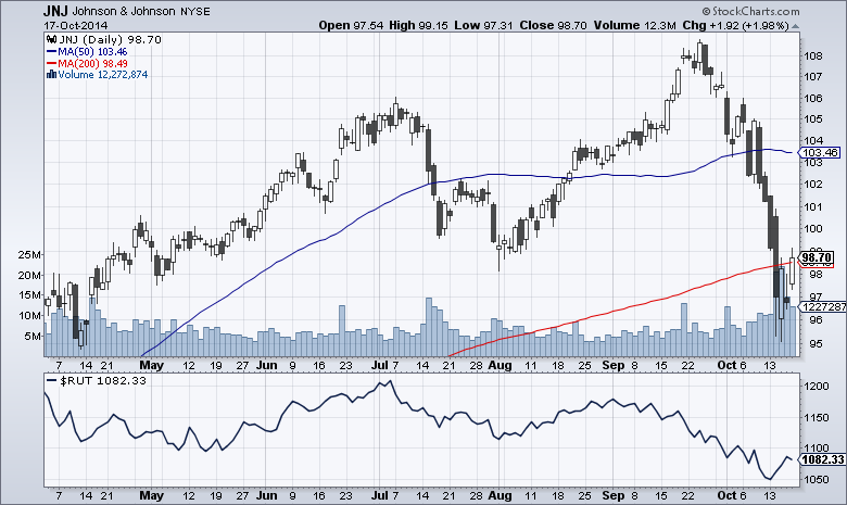
(Click on the chart to see its settings.)
Pitfalls:
There are a couple of things to be aware of when using the Price indicator:
- In addition to the "Price" Indicator that I'm talking about in this article, there is also a "Price (same scale)" Overlay. Make sure you don't confuse the two. In general, you'll want to use the "Price" Indicator for plotting additional stocks or unrelated indexes. The only time you'd use the "Price (same scale)" overlay is when you are plotting several related market indexes that have the same range of values (our Bullish Percent indexes for example).
- You can also choose to overlay one symbol on top of the chart's main price bars by adding a "Price" indicator with the "Position" dropdown set to "Behind Price." However, if you do that, it is important to remember that the two symbols are plotted on different vertical scales. That means that crossing signals are not valid on those kind of charts - but trend divergence signals are.
Q2: What are SCTRs and how can I use them?
A2: SCTRs (pronounced "Scooters") are short for "StockCharts Technical Rank." They are a relative strength ranking based on technical analysis techniques recommended by John Murphy. (For the precise formula, click here to read our ChartSchool article on SCTRs.) Whenever the markets are open, we are constantly re-ranking all the stocks we track and assigning them a number between 0 and 100 based on their relative technical strength.
You can see a stock's SCTR value in a couple of different ways. Probably the easiest way is by checking the "Full Quote" checkbox for your chart and then clicking "Update." The SCTR value will appear inside the Full Quote area at the top of your chart. The other way to add SCTR values to your chart is to add the "SCTR Line" Indicator to your chart. It is located in the same "Indicators" dropdown that I mentioned above - the ones with the MACD and RSI indicators (in additional to lots of others).
When you add the "SCTR Line" Indicator to your chart, not only do you see the current SCTR value for your chart's main ticker symbol, but you also see how that SCTR value has changed over time. Has the SCTR been increasing over time? Decreasing? Oscillating? The SCTR Line indicator can show you those answers at a glance. Here's an example:
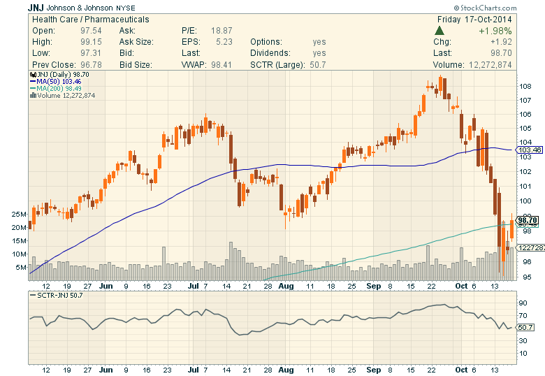
(Click on the chart to see its settings.)
For more on SCTRs, be sure to review this article and this video.
OK, hopefully that has helped everyone with those two popular questions. Be sure to join Greg for our next webinar which will be held next Friday (click here to register early, click here to view last week's episode, and click here to ensure you computer works with the webinar software ahead of time).
Take care,
- Chip
SITE NEWS
RECENT ADDITIONS TO STOCKCHARTS.COM
- MUCH MORE SCAN DATA AND MONTHLY PERIODS NOW AVAILABLE! - We've just upgraded our Scan Engine in a major way. Last week they had 1,000 trading days worth of data, now the have over 2,500 trading days. That additional daily data also allows us to now support monthly bar periods in our advanced scans! Just add the phrase "This month's" in front of your clauses and we'll do the rest. Here's an example:
[This month's RSI(14) x 70]
That scan returns all ticker symbols where the 14 month RSI has just moved above 70. Enjoy!
- FinGraphs Joins Our TAC Blog - We just added a new author to our TAC area. FinGraphs director Jean-Francois Owczarczak will now provide us with weekly updates using their unique charting style. Click here to read all about it.
CRB INDEX IS TESTING MAJOR SUPPORT
by John Murphy | The Market Message
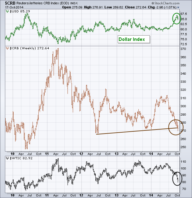
Today's message takes a look at commodity prices because they've been the focus of a lot of attention of late. That's because falling commodity prices are deflationary in nature, which is something central bankers are trying to stop. The weekly bars in Chart 1 show the CRB Index of nineteen commodities threatening a support line drawn under its 2012/2013 lows. Crude oil weakness has been a big drag on the commodity index (black bars). Despite a midweek bounce in crude, signs of a major bottom are still lacking. One of the main catalysts behind the commodity drop has been a rising dollar. The Dollar Index has suffered a minor setback over the last two weeks (green bars). But its uptrend is still very much intact. That's not an encouraging sign for commodity markets and the battle against global deflation.
- John
All StockCharts members have access to all of John's twice-weekly market analysis as well as exclusive member-only articles from Arthur Hill, Carl Swenlin, Erin Heim, Greg Schnell and Martin Pring. Given the current market fluctuations, shouldn't you be following our technical experts closely right now? Sign up for any of our charting services and get a free 10-day trial!
The Dow Diamonds (DIA) showed signs of a selling climax last week and forged an island reversal to end the week. First, let's look at the indicators to suggest that we had a selling climax or capitulation of sorts. A selling climax involves a very sharp decline with extremely high volume. Price-wise, DIA fell over 8% from high to low, 10-period RSI moved below 30 and the 10-day Slope indicator hit -1. These indicators confirm that DIA fell sharply in a short period of time. Volume-wise, the Volume Oscillator (5,100,1) surged above 100 and this means the 5-day average of volume was over twice the 100-day average. We can also see DIA volume exceeding the 15 million mark twice last week. In fact, Wednesday's surge to 25 million was the highest volume of the year.
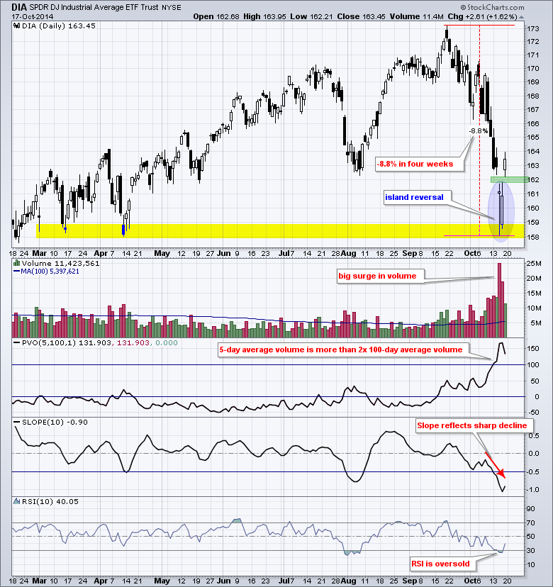
DIA followed up this selling climax with an island reversal over the last four days. The ETF gapped below 162 on Wednesday, traded below the gap for two days and then gapped above 162 on Friday. These gaps created a two-day price island that trapped shorts with losses. Also notice that this week's lows formed at support from the spring lows. So now what? Short-term, the island reversal is valid as long as the gap holds. After all, a strong reversal should hold. A move below 161.5 would fill the gap and negate this short-term reversal. We could then see a test of the lows in the 158-159 area. Keep in mind that this is a short-term outlook. Volatility remains high and the markets are in risk off mode overall.
Good trading and good weekend!
Arthur Hill CMT
THE NUCLEAR OPTION ROLLS OVER
by Greg Schnell | The Canadian Technician
In this world of crosscurrents and 10% pullbacks, The Nuclear ETF (NLR) was no different. It has made about a 10% pullback off the highs.
But unlike the S&P 500 ($SPX), the NLR made it's highs in March not September. So while this looks the same it feels different. We have broken down through the support level and have competed a rounded top or double top. This is an important chart to watch right now.
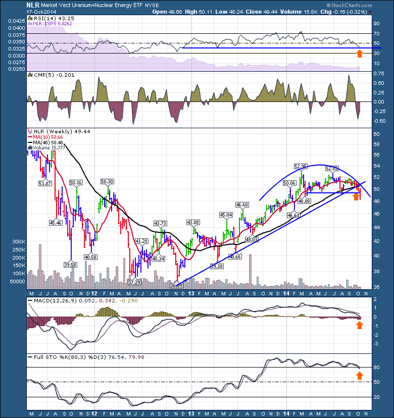
Why now? Well, it closed back above the support level from the topping structure. All the weekly indicators are sitting at important levels like the MACD at 0, the Full Sto's right around 80 and the RSI in a bull market trend holds above 40. The CMF rose this week, so that is good news. The volume did not really change on this breakdown, so maybe its an investable low. Should this support level fail to hold, I would be very cautious expecting this sector to rise in the face of falling commodities in general. I am aware of the demand from China for Uranium and the whole picture on the number of new plants. But that's the story and this is the reality. It is threatening lower prices which means we'll have to wait for the story to play out some time in the future.
Good trading,
Greg Schnell, CMT
IMPORTANT CYCLE LOW DUE SOON
by Carl Swenlin | DecisionPoint.com
Fair warning! If you read this article and get hooked on cycle analysis, you will rue the day. If we look at price charts, we can clearly see that prices move up and down in cycles, but trying to use this tool can be frustrating beyond words. There are certainly others who are better at it than I, but I have kept an eye on cycles throughout the years. In the last few years I have pretty much ignored cycles, because they have more or less disappeared under the mountain of money printed by the Fed, but I noticed that they seem to have reappeared since the February price low. So, while I have been resisting the idea of writing this article, StockCharts has some very cool cycle annotation tools (darn it!), and I just couldn't resist doodling with them.
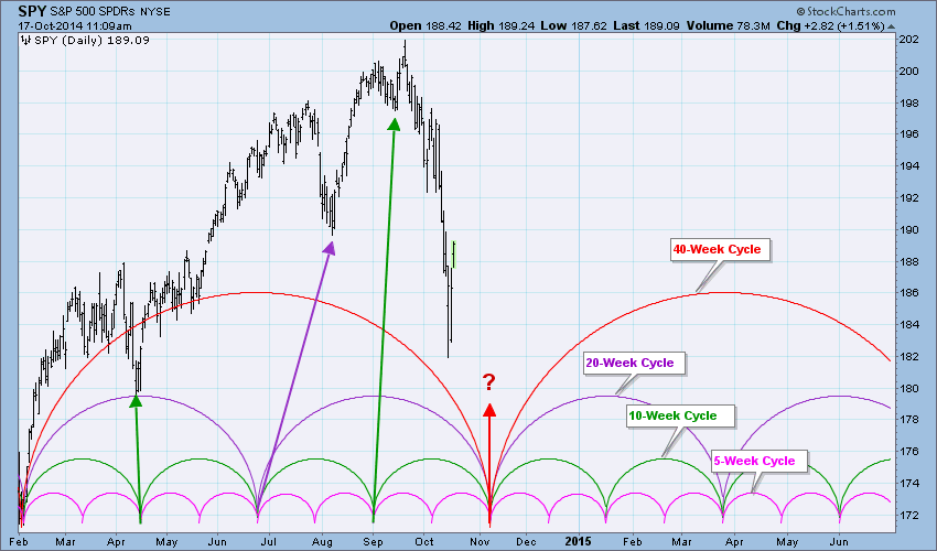
To begin, let me say that these are my personal views regarding cycles, and others will have different ideas about them. My work with nominal cycles involves the 5-Week, 10-Week, 20-Week, and 40-Week (aka 9-Month) cycles, which seem to move under the market like ocean tides. They are not tied to any fundamental events, in fact such events often disrupt the normal ebb and flow of cycle movement. The shorter cycles are subordinate to the longer cycles, meaning that a shorter cycle is considered to have bottomed at the same time the longer cycle bottoms. Nominal cycles are measured from trough to trough.
What prompted me to write this article was the chart of current market action and its apparent fit into a cycle template. The dominant feature on the chart is the projected 40-Week Cycle trough (and nesting of all subordinate cycles) in early November. We will look at this more closely a little later, but first let me explain a few other things.
From an intermediate-term perspective the 40-Week and 20-Week Cycles are the most important, and they are of almost equal importance. There are, obviously, two 20-Week Cycles within the 40-Week Cycle, and most of the time the first 20-Week Cycle will run longer than the second one. On the chart above we see that a 20-Week trough was due in June, but it didn't manifest itself in price movement until August, about six weeks late. The current 20-Week Cycle will be compressed when the 40-Week Cycle makes a trough, currently projected for November 6. But we are reminded that cycle analysis often works best in hindsight.
The big question at this point is if the projected November 6 trough will arrive on time, because the cycle could arrive early or late by a month or so. This is where the aggravation begins. An argument could be made that it actually arrived early with this week's price lows. I am inclined to think that there will be a technical bounce (already started) out of those lows followed by another decline to retest those lows. This process could take several weeks, putting the retest low right around the first part of November. The retest low could be higher than recent lows, but I would still consider it to represent cycle completion if it arrives near the projected date.
Finally, we look at the price arc and note that the 40-Week Cycle price high is located to the right of center. This is called a "right translation" and it is bullish.
Conclusion: This has been a very brief overview of nominal cycles with a focus on the current 40-Week Cycle. The idea that an important low may be made after the bounce out of this week's lows is by itself sound on a technical basis. Framing it within the cycle template makes it more compelling. The right translation implies that the market may not be finished making new highs. But before we rely too heavily on a projected cycle low that is very close to Halloween, remember that Bela Lugosi would say, "Bevare!"
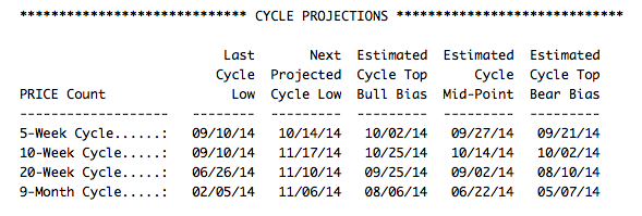
Note: In our DP Alert Daily Report we publish a nominal cycle projection table. Sample below:
Make no mistake about it, volume has exploded and stock prices have fallen and lost key support levels. That combination is bearish in and of itself. But the part that really bothers me is that intermarket warning signs have been flashing for months so this high volume market drop confirms that we're likely in for more weakness before the stock market improves.
One warning sign that I began discussing several months ago was the relative weakness in small cap stocks. The Russell 2000 topped in early March and did not follow the other major indices to fresh new highs over the summer. Yet on CNBC and elsewhere, all the talk centered around all-time highs on the S&P 500 and how the U.S. economy was gaining strength. It was certainly true, but rarely did media outlets caution individual investors about where the money was rotating to on a relative basis. And, as far as I'm concerned, the charts speak much louder than words on CNBC. If the U.S. economy was truly stronger than in other parts of the world and gaining strength, then why wouldn't the Russell 2000 be leading the action to the upside? This index is comprised of companies who sell almost exclusively to customers in the U.S.!
The potential for domestic economic slowdown and a possible recession increases when small caps lag on a relative basis. Check out this chart:
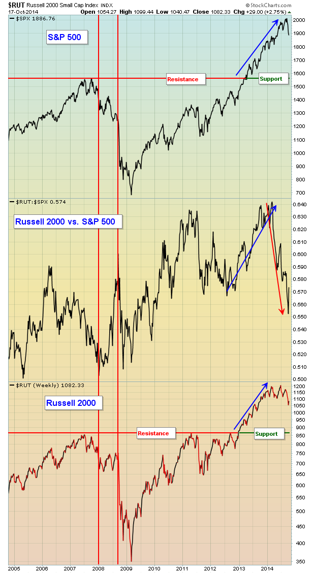
I want to make a few points about this chart. First note that, for the most part, when the S&P 500 and Russell 2000 rises, the relative strength of small caps ($RUT:$SPX - middle chart) tends to rise as well. This tells us that the more aggressive small cap index is leading the benchmark S&P 500 to the upside. That's very good news and generally leads to bull market sustainability because it's signaling that investors remain aggressive. But check out the relative downtrend in the $RUT:$SPX in 2006 and 2007, just before the stock market top in October 2007. Money was rotating away from small caps and that was a warning sign. Fast forward to 2013. Note that as both the S&P 500 and Russell 2000 were moving higher, the relative performance of small caps was EXCELLENT. That completely changed in 2014. Money has been rotating away from the Russell 2000 ahead of the recent stock market downturn. This was just one of the several warning signs that, in my opinion, has led to the recent market rout. There was one false signal given, which is highlighted by the two red vertical lines. During that period in 2008, small caps outperformed which could have been misconstrued as a bullish sign. The primary reason for this incorrect signal was due to the sudden collapse of financial stocks which carried the S&P 500 down much faster than its small cap counterpart. Still, it's obvious to me that following the relative performance of these two indices vs. one another provides us valuable clues as to future market direction and the possibility of a major shift in how big money views the stock market.
Let's discuss one more warning sign - the relationship between consumer discretionary, or cyclical, stocks (XLY) and consumer staples stocks (XLP). When our economy is expected to grow, discretionary stocks outperform their staples counterparts as consumers feel good about spending money on "discretionary" items. When a slowing economic period approaches, money will begin to rotate to the safer consumer staples stocks as hopefully everyone will continue to buy toothpaste and soap no matter the economic conditions. Following a simple ratio of XLY:XLP can yield some rather dramatic clues about the likelihood of a sustained market advance. Take a look at this chart:
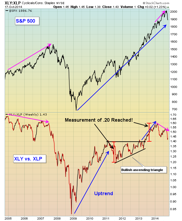
It's easy from this chart to see that money was rotating away from discretionary stocks in 2006 and 2007 AHEAD of the 2007-2009 bear market. In 2013, the ratio between consumer discretionary and staples stocks was awesome as investors continued pouring money into discretionary stocks on a relative basis and the bull market was sustained. In 2014, that relationship completely reversed course, however, as market participants "prepared" for upcoming market weakness by rotating towards more defensive areas like consumer staples.
On Thursday, October 23rd, I will be hosting a FREE webinar to discuss the above warning signs, in addition to several more. Also, I'll discuss what I'll be looking for to determine if and when the bull market will resume. CLICK HERE for more details. Hope to see you there!
Happy trading!
Tom Bowley
Chief Market Strategist
Invested Central

Profitable investing demands a unique type of profitable thinking. Once you've achieved this consistently in your thinking and investing, you are ready to move on to focusing on how best to nudge the probabilities in your favor with respect to all elements of your methodology. Specifically, the example I'll use in this instance is William O'Neil's CANSLIM methodology that is so widely...
Read More


 Profitable investing demands a unique type of profitable thinking. Once you've achieved this consistently in your thinking and investing, you are ready to move on to focusing on how best to nudge the probabilities in your favor with respect to all elements of your methodology. Specifically, the example I'll use in this instance is William O'Neil's CANSLIM methodology that is so widely...