Hello Fellow ChartWatchers!
It was "back to the future" time for the markets this week with the Dow falling over 350 points and ending up just below 16,000. This has caused lots of consternation and teeth-gnashing in the mainstream financial press, but let's back up and get some technical perspective before drawing conclusions. Here's my chart of the current big picture:
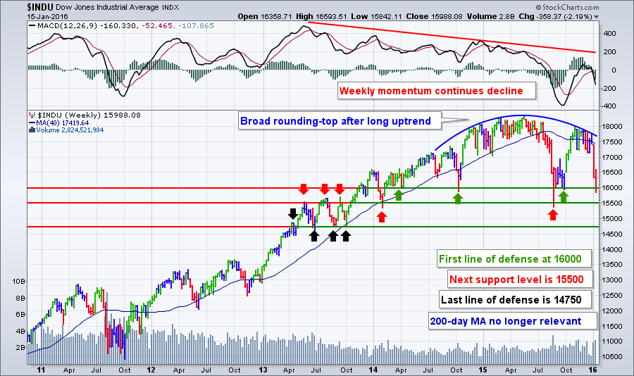
This is this same chart I featured during last week's webinar. (So far, I haven't needed to update the annotations either!) There's a lot of stuff going on here so let's break it down:
- The market continues to roll over (blue line) after a l-o-n-g uptrend stretching back to at least 2011. Investors that got used to that long uptrend were spooked last August when things first broke down. Those same investors loved it when the market quickly recovered in October. Now - somehow - they are once again shocked by the recent decline back down to the same levels we saw in August/September. (They seem to be "memory challenged" in my book.)
- Looking above the price chart, we see that the market's weekly momentum continues to decline with the MACD below zero and heading lower quickly. That's not surprising given the sharp declines over the past two weeks. You can expect momentum to continue moving lower for several more weeks at least.
- The green arrows on the chart point out our "first line of defense" - 16,000 - which has proved very important to the market in the past. Will it provide support for things this time around? That is THE questing right now. There was some evidence of support at 16,000 at the end of the day of Friday, but we won't know for sure until Tuesday's open. (Monday is a market holiday in the US.)
- The interesting thing is that 15,500 is probably a more important support level for the Dow (as shown by the red arrows). That's where last August's big drop turned around. It also was an important level back in 2013. As I said last week, if 15,500 doesn't hold, that will be the time to become more seriously concerned about the long-term health of the market.
- The black arrows show the "last line of defense" which is around 14,750. Let's not talk about that yet shall we?
- One last thing to notice on this chart: weekly volume hasn't spiked siginificantly during the past two weeks. Yes, it is high, but not unusualy so like it was in August.
Even though the market headed lower last week, that doesn't mean that there weren't any opportunities for the bulls. Our Sector Rotation PerfChart (below) shows you exactly where those opportunities were:
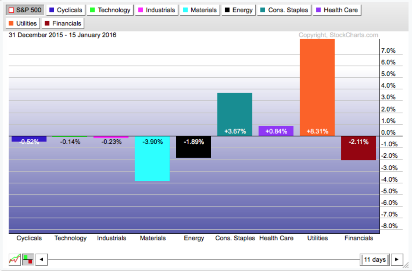
This chart says that since the start of the year, three sectors - Consumer Staples, Health Care, and Utilities - have out-performed the S&P 500. Since those are key defensive sectors, we should expect the market overall to keep moving lower in the near term.
Note that the chart above doesn't show the entire picture however because the S&P itself has been heading lower too. Let's see this chart using absolute performance instead of performance relative to $SPX. By clicking on the grey "S&P 500" box in the upper left corner of that chart, we get the absolute picture:
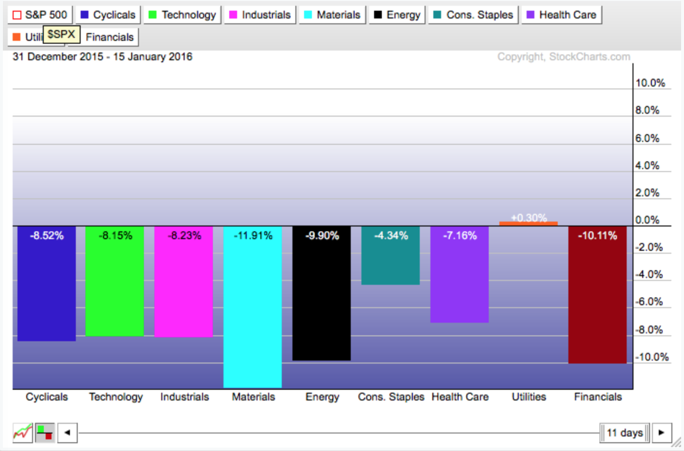
Hmm... That's kind of depressing. We now see that only the Utilities sector (which is a proxy for the Bond market i.e., the "anti-stock market" sector) has shown a gain in January. If you need to buy stocks right now, Utilities (and possibly Staples and Health Care) are the stocks to look at.
Clearly now is a time for caution. In reality, the charts have been negative since early 2015. That said, now is not the time to "tune out." As the market declines, technical analysis becomes more and more important. As I demonstrated above, charts can show you where previous support levels are located and technical indicators can tell you if those levels will hold or not. The expression "Wall Street is on sale" is becoming more true every day as stocks decline. Use charting to help you discover when the sale is ending.
- Chip
P.S. Don't think there are any bullish charts out there right now? Check out Campbell Soup which was returned by my "Strengthening Strength" scan. (See last week's webinar for details on that scan.) No promises, but it is still doing well and is in one of the key defensive sectors (Staples) this is doing relatively well right now. Something to keep an eye on.
SITE NEWS
RECENT ADDITIONS TO STOCKCHARTS.COM
- CONTINUED SITE DESIGN IMPROVEMENTS - Both ChartSchool and the Support area have been upgraded. The Free Charts page is next on the agenda...
- WEBINAR SCHEDULE - Did you know we host at least 8 FREE webinars every week? With great hosts like Tom Bowley, Greg Schnell, and Arthur Hill? Just go to our homepage and scroll down a little bit to see the schedule. Be sure to sign up for as many as you can. They will GREATLY improve your investing results. See you there!
- WEBINAR ARCHIVES - In case you haven't heard, we archive all of our webinars. They are all available for replay at this address: http://stockcharts.com/webinars/archives
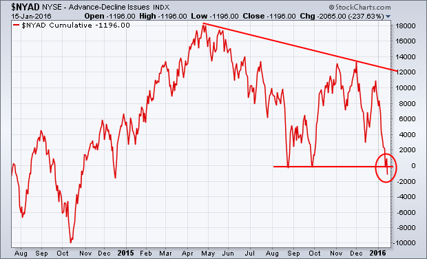
A lot of us on this site have been warning about the fact that the fourth quarter rally was mainly driven by large cap stocks and wasn't being supported by the vast majority of stocks. That's been shown by breakdowns in small and midsize stocks and the fact that 80% of big board stocks have fallen below their 200-day averages. The best known measure of market breadth is the NYSE Advance-Decline line. Chart 1 shows that line falling well short of its 2015 high during the fourth quarter, which was an early warning. This week's drop below its August/September lows to a 52-week low is another. That puts the AD line in its first downtrend since the bull market started seven years ago. That's a bad sign for the stock market.
The concept of "market breadth" also applies to global stocks. In a healthy uptrend, most stocks markets should be rising. When most are falling, that 's bad for everyone. I've been pointing out the fact that foreign shares have been much weaker than the U.S. and have already started to break down. That's not good for them or us. The weekly bars in Chart 2 show the Vanguard FTSE All-World ex-US ETF (VEU) falling to a three-year low after having completed a "double top" reversal pattern (see circles). The VEU has lost -22% since last spring and is in a bear market. That includes developed and emerging markets. EAFE iShares (which measure foreign developed markets) has fallen to a two-year low, while Emerging Markets iShares are trading at the lowest level since 2009. It's pretty tough for the U.S. to hold up when the rest of the world is in a downtrend. Global stocks also become more highly correlated during downtrends. That increases the odds that we've started to follow them lower.
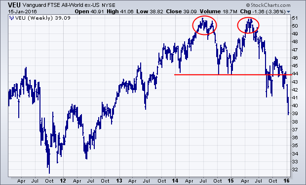
BOTTOM LINE... With foreign stocks in a bear market, U.S. stocks are in danger of following suit. Internal market measures show that the market is already much weaker than the major stock indexes. That also increases the odds that 2015 lows will be broken. If that happens, the S&P 500 could lose another 10-12% before reaching major support. Sector rotations also show that investors have been rotating toward defensive consumer staples and utilities, and have been selling economically-sensitive stocks. Commodity-related stocks are still being sold hard. Countries tied to commodities are being hit especially hard, as are their currencies. Chinese stocks and the yuan are sinking together. The dollar and yen are the only two currencies holding up. A firm dollar is keeping downside pressure on commodities. Money leaving stocks is moving into the safety of Treasury bonds and gold (not to mention cash). That's what normally happens in times of financial stress. Economists are starting to worry about the health of the U.S. economy. Stock selling suggests investors are worried too. On a lighter note, enjoy the three-day weekend. We can all use a timeout.
Chartists can use the percentage of stocks above the 200-day EMA to rank the sectors based on component trends. Using this breadth indicator, we can separate the weak sectors from the strong and get a good idea of the current market environment. I am working under the assumption that a stock above its 200-day EMA is trending up and a stock below its 200-day EMA is trending down. Chartists want to avoid sectors where the majority of stocks are trending down and focus on sectors where the majority of stocks are trending up. The chart below shows the percentage of stocks above the 200-day EMA for the S&P 500 and the four top sectors in the S&P 500. Note that this chart was created with a StockCharts Extra account, which allows chartists to plot up to six symbols on one chart. StockCharts PRO users can plot up to ten symbols on one chart. I arranged the windows with the highest percentage at the top and the lowest at the bottom.
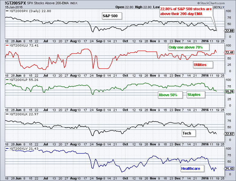
There are several important takeaways here. First and foremost, just 22.8% of S&P 500 stocks are above their 200-day EMA. Second the %Above 200-day EMA is below 50% for just two of the nine sectors. The vast majority of stocks in the S&P 500 are in downtrends and there is widespread weakness throughout the sectors. This indicates that we are in a bear market environment. Utility stocks are holding up the best because over 70% are still above their 200-day EMA. Consumer staples are next with 55%. The drop from here is pretty steep because just 23% of tech stocks are above their 200-day and 21.43% of healthcare stocks are above their 200-day.
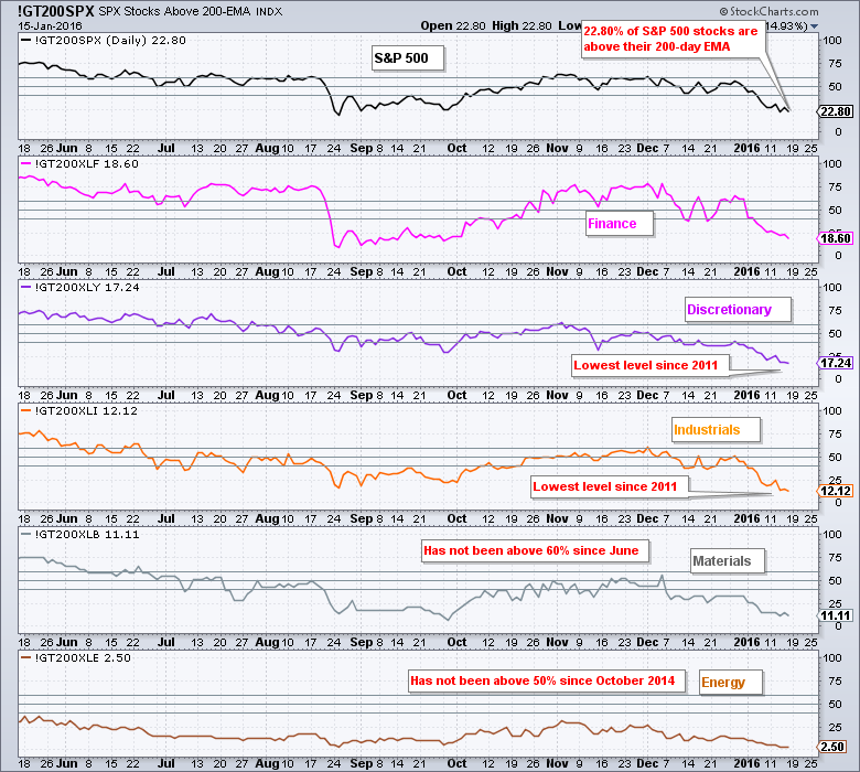
The percentage of stocks above their 200-day EMA is below 20% for the remaining five sectors. Just 17% of consumer discretionary stocks are above their 200-day EMA and this is the lowest level since 2011. Similarly, just 12% of industrials stocks are above their 200-day EMA and this is also the lowest level since 2011. These levels may seem oversold, but the trends are what are important here and the trends are clearly down. A mere 2.5% of energy stocks are above their 200-day EMA and this is indicator has not been above 50% since October 2014. Simply paying attention to this indicator would have kept one out of energy stocks for the last fifteen months.
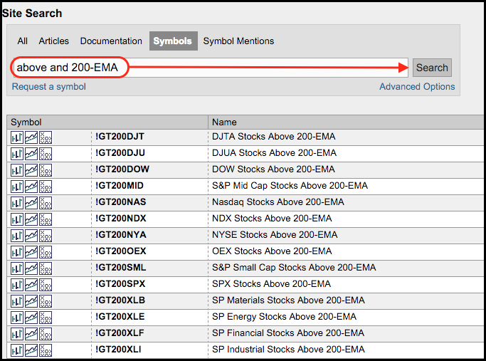
Note that you can also see the percentage of stocks above the 50-day EMA and the 20-day EMA simply by changing 200 to 50 or 20 in the symbol. For example, !GT200XLK would be !GT50XLK and !GT20XLK. Just leave the sector symbols unchanged. This will offer a look at the medium-term and short-term trends. Here is a symbol catalog link with the symbols.
Follow me on Twitter @arthurhill - Keep up with my 140 character commentaries!
****************************************
Thanks for tuning in and have a good weekend!
--Arthur Hill CMT
Plan your Trade and Trade your Plan
*****************************************
I was recently at an event where someone suggested a simple Technical Analysis 101 of the current market. Today, I want to do that in one chart.
There are some simple theories in the market. When the market is going down, the volatility picks up. Using some of the most common tools of Technical Analysis, this market breakdown has been coming for a while. The point of this review is to identify signals that can help us spot the market trend and when it might end in either direction.
This is the $SPX with one of the simplest indicators. The 40 Week Moving Average shown in green. When the market is below the 40 WMA and the average is pointed down, we have to be aware of the possibility of a market breaking lower. Notice how the market had trouble getting back above the 40 WMA for the last 3 major tops in 2000 and 2007. You'll also notice both 2010 and 2011. The Federal Reserve acted during the low points in the market in 2008, 2010, and 2011. The last QE was late 2012 through to October 2014.
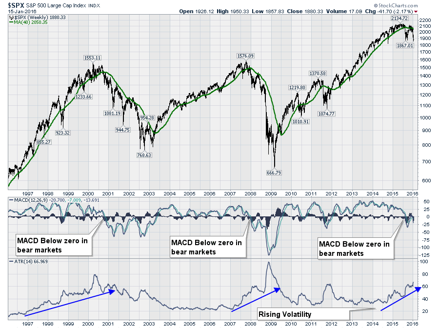
I have duplicated the same chart above and posted it below to help avoid scrolling. The second indicator is the MACD. The MACD uses two different moving averages and it helps indicate market momentum. To use a driving analogy, one moving average is the average speed for one hour driving around town, where the other moving average is for one minute around the city. You can imagine how they can be different as you speed up to leave the city (shorter moving average rises up faster) and then they both become the same as you spend a long time at highway speeds. In declining momentum, you have a long period at highway speeds, and you slow down as you enter the city limits. The longer we spend in the city limits the lower our long-term average speed. When we use these different moving averages in the stock market, it helps us see acceleration (prices moving higher quickly) and deceleration ( a slowing down of the market speed). Looking at the MACD, notice the MACD started dropping near the end of 2014 from 'highway' speeds. More importantly, when the MACD rolls over at or near zero after going below zero initially, this really confirms a very slow or bearish market momentum. We are actually going in reverse when the momentum is declining and below zero. This means lower prices. We have recently stopped accelerating from the late September lows and started decelerating while near zero which is a major clue that the market is very weak. In the big picture, this market could be expected to move lower over the next few months based on the direction of the MACD. Normally the negative momentum slows down before it starts rising. Right now it is accelerating downward.

Next is the ATR. This measures the Average True Range or the wide swings in the market. (We calculate the distance between the market high for the week and subtract the market low for the week = 1 weeks range). Add up all the ranges for a number of weeks (14) and divide by the number of weeks (14) will give you an Average True Range. In the chart above, we have used 14 weeks which is the default setting. Based on the theory that the volatility increases as the market moves lower, we can see the ATR has been rising since QE ended in 2014.
Probably the most important signal on the chart is that we have all three signals in place for a bear market at the same time. The market is below the 40-week moving average, the momentum is dropping and below zero, which means lower prices, and the volatility is rising meaning the markets are more volatile. That increase in volatility happens in falling markets. While there will be tradeable rallies for a few weeks at a time, the big picture is the market is working its way lower. Each week gives us more data and as the market changes, we will keep analysing the data. Notice that when the stock market actually bottomed in 2003 and 2009, the ATR or the volatility, had been dropping for a long period of time.
For now, some of the short-term indicators that are not shown, are signalling deeply oversold. I posted an article on the Don't Ignore This Chart blog on Friday. How Do You Approach This $NYHL Chart? This article is a great example how oversold the market is currently as we registered an extreme level that has only been reached during the collapse of Lehman Brothers. So, while the mood is bearish, it is also at a level where we would expect the market to bounce from, just to ease the oversold condition. When the volatility is this high, stops are very important as is position size.
If you would like more information about the current market, I would encourage you to watch some of the webinars by following this link ( Upcoming webinars ) or watch the recordings of the webinars. You can go back a long way to hear about how the weakness in the market was developing. (Webinar Archives). It is this constant review with new information that creates the value in Technical Analysis.
You can also follow me on Twitter @schnellinvestor. If you would like to be kept up to date as these indicators roll along, follow these links to get email updates. Commodities Countdown. and The Canadian Technician. Click the big green YES button at the bottom of each of the articles. With lots of quality articles, you can follow each of the writers on their blogs. Arthur, Tom and I all post on the Don't Ignore This Chart blog so you can get an almost daily update. Be careful out there, but don't be surprised if we get a brief rally overt the next few weeks. It does not look like a long-term change from the downtrend at this point. But that's why we review the new information on the charts each week.
Good trading,
Greg Schnell, CMT
LAST SECTORS STANDING
by Erin Heim | DecisionPoint.com
If you go to our DP Reports blog and take a gander at the DecisionPoint Market/Sector Summary, you'll find there are only two sectors left with BUY signals. I'll give you a moment to guess which ones. Those of you familiar with John Murphy's sector rotation analysis will likely guess correctly. Both the Utilities and Consumer Staples cap-weighted and equal-weight ETFs are on BUY signals. An Intermediate-Term Trend Model BUY signal is generated when the 20-EMA crosses above the 50-EMA. Unfortunately, three of those ETFs have declining 20/50-EMAs. Let's look at the charts to determine if those signals will hold up much longer given the overall market malaise.
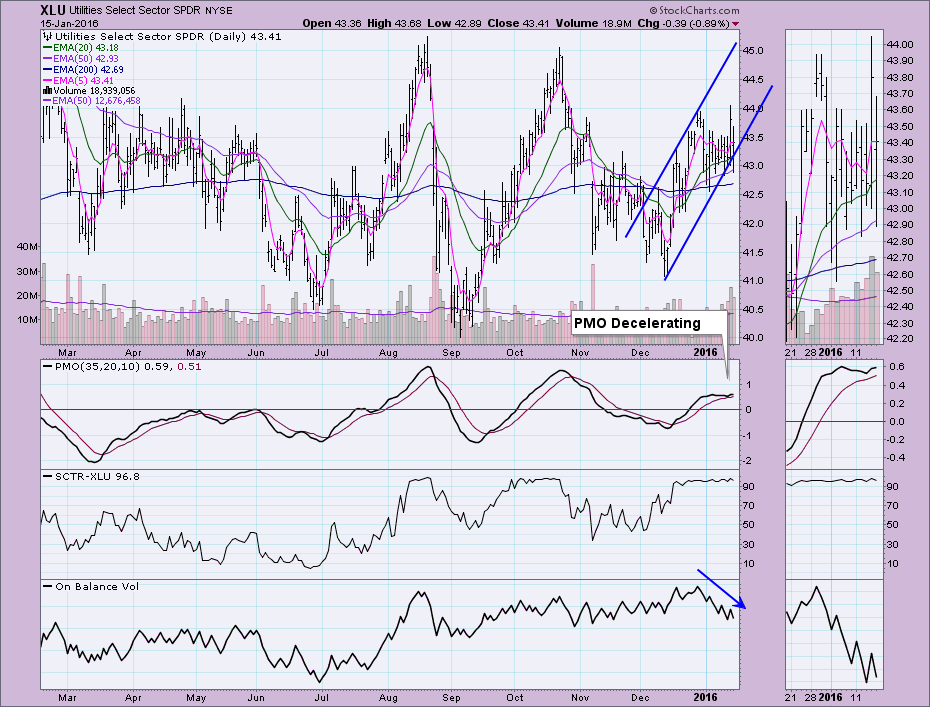
The Utilities SPDR (XLU) has the best daily chart of the four. All of the EMAs are configured positively and the 20/50-EMAs are rising which should keep the BUY signal in place for some time. Price has been in a rising trend channel that unfortunately was penetrated on Friday's decline. The Price Momentum Oscillator (PMO) has decelerated but it is still rising and isn't that overbought. The OBV suggests some serious weakness as it has been declining in a negative divergence with price's rising trend. While this is one of the stronger sectors, there are still signs of trouble.
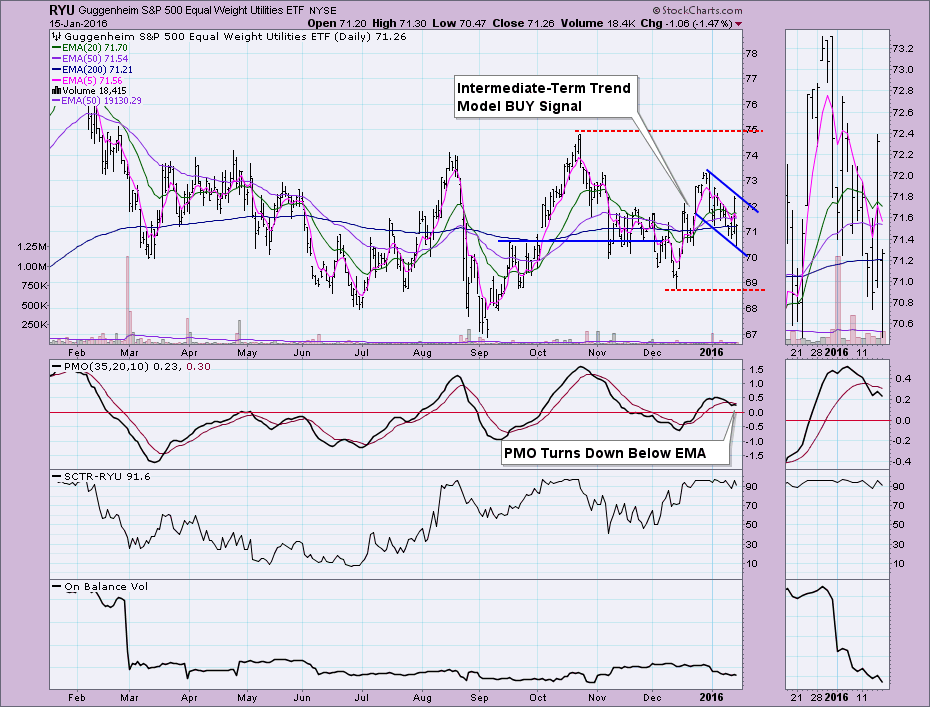
The equal-weight Consumer Staples ETF (RYU) has not been fairing as well. Price has been in a declining trend and the 20-EMA is working its way down toward the 50-EMA which would negate the current Intermediate-Term Trend Model BUY signal. The PMO just topped below its signal line which is very bearish. Price could find support at the December low.
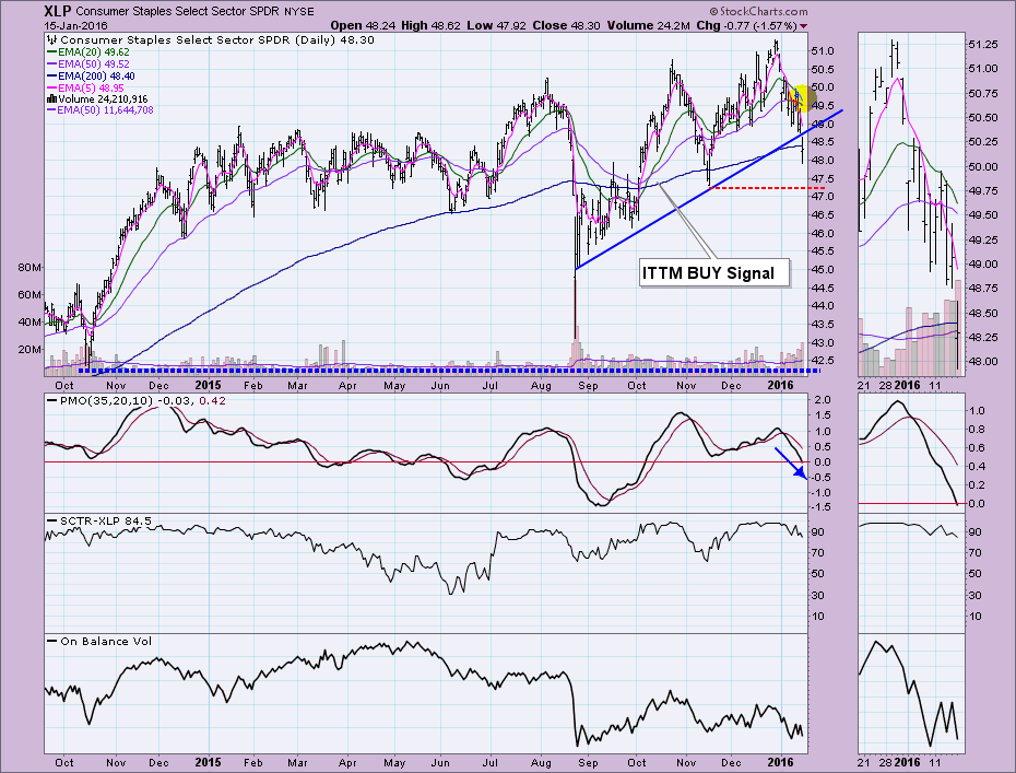
The Consumer Staples SPDR (XLP) has been dropping since reaching its high at the end of December. The rising bottoms trend line was broken on Friday and the 20-EMA is likely going to have a negative crossover the 50-EMA next week barring a major rally that would bring price above the 50-EMA. You could make a case for a double-top formation which would suggest a drop below the November low. The PMO is dropping and is now below the zero line. Notice the SCTR value is beginning to deteriorate as well.
The equal-weight Consumer Staples ETF (RHS) is also trying to lose its ITTM BUY signal as the 20-EMA reaches toward the 50-EMA. Price gapped down on Friday nearing November low. Momentum has been negative for some time as the PMO has fallen down to neutral territory. The SCTR value is beginning to deteriorate. Friday's volume was minimal on the gap down which could be considered somewhat positive.
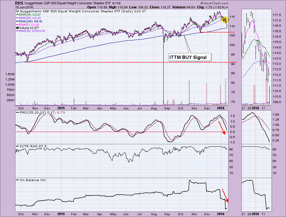
Conclusion: Certain sectors tend to do much better in bear markets than others and Consumer Staples and Utilities are in that group. However, they are beginning to show some weakness which could be indicative a possible market bounce or at least a pause in the current downtrend.
Come check out the DecisionPoint Report with Erin Heim on Wednesdays and Fridays at 7:00p EST. The archives and registration links are on the Homepage under “What’s New”.
Technical Analysis is a windsock, not a crystal ball.
Happy Charting!
- Erin
Technical analysis doesn't try to answer why questions. Fundamentalists are constantly bewildered by price action, especially when it seems to contradict fundamental news. Technicians simply don't care. The stock market looks ahead and therefore price action precedes news. That's why it's important to look at how the market reacts to news, not to simply look at the news itself. This past week was a perfect example. JP Morgan Chase (JPM) reported quarterly results that exceeded expectations. In fact, take a look at the banks that reported quarterly results last week and how their bottom line compared to consensus estimates:
JPM: 1.35 vs 1.29
OZRK: .57 vs .56
C: 1.06 vs 1.04
PNC: 1.87 vs 1.80
RF: .21 vs .19
USB: .79 vs .79
WFC: 1.03 vs 1.02
How are those results? Six banks beat EPS estimates while the other met expectations. Not a single earnings miss among them. Did price action follow fundamental results? Check out this chart and you be the judge:
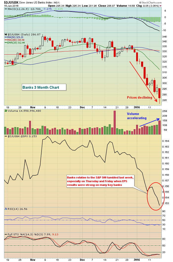
What I find particularly alarming is Thursday's action. The stock market had a major recovery and that morning JPM had posted very strong earnings. While banks did move higher on the session, they badly lagged the S&P 500. When you see great fundamental news and the relative reaction is so poor, you have to scratch your head and wonder. Again, the news said to buy, but relative price action is saying otherwise.
Clearly, the short-term action in banks is uninspiring - and that's with some sugar coating. Now let's see what the action last week means on the long-term chart:
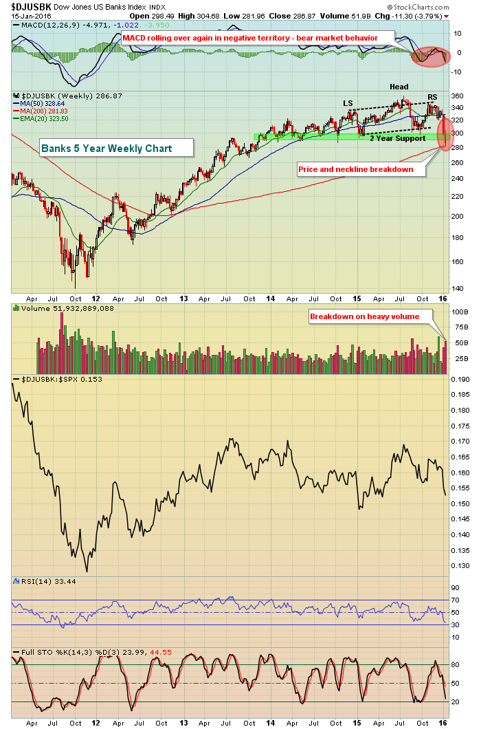
It's difficult to put a positive spin on this chart. Banks lost price and neckline support and did so on very heavy confirming volume. In addition, the weekly MACD is confirming the accelerating selling momentum and remains deep in negative territory. We have to keep in mind that banks need to remain healthy technically to support an ongoing bull market. They provide the credit necessary for businesses to grow as we are a credit-reliant economy. It's not comforting to see banks breaking down in both the short-term and long-term.
Happy trading!
Tom
WILL EARNINGS MATTER?
by John Hopkins | InvestEd Central
Earning's season will kick into high gear this week and trader's are wondering how much they will matter after the market slaughter already experienced this year. Since this is the worst start to a year for stocks it's a legitimate question.
Let's start with the notion that the market is extremely oversold and that technically, just about everything is broken. For example, the Russell 2000 is well below all key technical levels and has fallen 22% from its June 2015 high, putting it in bear market territory. And its fallen during a period that is generally quite bullish for small cap stocks.
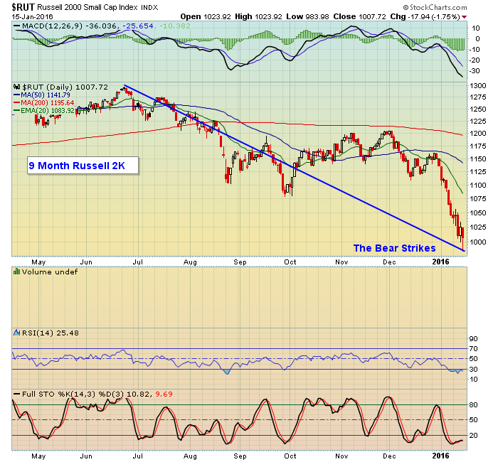
Though neither the Dow nor the S&P has entered bear market territory they are down 12.7% and 11.9% from their respective highs, so nothing like the Russell 2000, but nothing to write home about either.
At EarningsBeats.com we scour the market for stocks that have strong fundamentals - earnings - and also have strong technical attributes. Historically we have found that stocks with these two attributes generally outperform the broader market. But we've also found that when the market is reeling like it has been lately it's tough for even strong stocks to hold their ground.
Now that thousands of companies will be reporting earnings over the next several weeks we're going to see if those companies that do report strong numbers can hold up. We might also start looking for companies that miss analysts expectations as they could be high reward to risk short candidates. This would mark a change in our strategy since historically we have focused on long trading candidates or simply moving to cash when the market is soft. But as the old saying goes, desperate times call for desperate measures.
This does point to the notion that when the market is in turmoil it requires a different approach. It starts with the recognition that a more bearish environment makes it harder to succeed on the long side so expectations need to be lowered. If you continue to trade on the long side you might want to deploy less capital and grab profits that come along more quickly. And it becomes even more important than ever to have appropriate stops in place for those trades that don't work out. And for many, simply moving to the sidelines to protect capital could be the best alternative.
We will be paying close attention to the market's reaction to earnings over the next few weeks to see which companies are rewarded and which ones are punished. We'll then zero in on which ones provide the best profit potential in this tricky environment. If you want to get on our list to see what we come up with just click here.
At your service,
John Hopkins
EarningsBeats.com

Thomas Edison said "Vision without execution is hallucination." Real estate experts love to claim that success is based on "location, location, location." For his recent book, The Art of Execution (Harriman House 2015), Lee Freeman-Shor analyzed over 30,000 trades by 45 professional investors and concluded that success in the stock market comes down to "execution, execution...
Read More


 Thomas Edison said "Vision without execution is hallucination." Real estate experts love to claim that success is based on "location, location, location." For his recent book, The Art of Execution (Harriman House 2015), Lee Freeman-Shor analyzed over 30,000 trades by 45 professional investors and concluded that success in the stock market comes down to "execution, execution...