Hello Fellow ChartWatchers!
We have lots to talk about since our last newsletter! For those of you who have been watching the "ChartWatchers LIVE" webinar, you know that for almost three months prior to the recent market collapse on August 19th, we had been expressing concerns over the market's slowing momentum and weakening breadth statistics. Well, clearly, the collapse that occurred during the 19th thru the 24th was the "big change" that those indicators were pointing to. The question since then has been and continues to be "Now what?"
The reality is that technical analysis cannot say a while lot about what's coming next immediately after a big change like this. All the trendlines are broken and all the indicators have signaled their signals. And that is as it should be - the market needs time to establish its new direction and so why shouldn't the technical be any different? It will take time for new trends to emerge and things like moving averages and other indicators to re-establish themselves. Currently, any short/mid-term indicators that use data from before August 19th will give confusing signals because the mass psychology of the market was very different then versus now. (Note: I'm generally talking about a one-week to three-month time horizon. If your time horizon is long enough, this is just a bump in the road.)
It's also times like this that many of the less reputable chart techniques are dusted off and trotted out for the gullible to "enjoy." Don't be fooled! If a charting method isn't grounded in the mass psychology of the market - the battle between fear and greed that drives stock prices - then it is just a guess in sheep's clothing. Caveat emptor! My strong advice to anyone who will listen is to remain patient during this volatile time. Wait for the technicals to settle down and come to you. Trend and momentum will return to the market soon but until then, be very wary.
Keeping that warning in mind, one thing we can look at is the behavior of the S&P Sector Rotation PerfChart since the August collapse. Check it out:
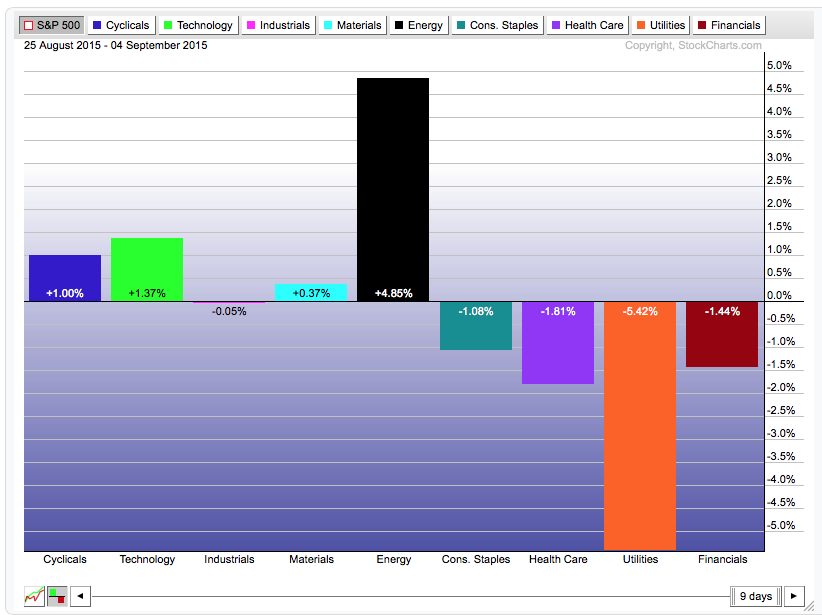
(Click the chart for a live version although, as time marches on, you will need to reset the start date to "25 August" by dragging the left side of the slider to the left with your mouse.)
This shows the performance of the nine S&P Sector ETFs relative to the performance of the S&P 500 index itself. The "offensive" sectors are on the left and the "defensive" sectors are on the right. Prior to the August collapse, the defensive sectors were outperforming the S&P and the offensive sectors were underperforming. That indicated that the market was pessimistic about future economic growth and reluctant to put lots of money into the stock market as a whole. In the 9 days since the bottom, things seem to have changed significantly with the "defensive sectors" underperforming the S&P and offensive sectors like Cyclicals and Technology outperforming the market.
Now, clearly, there are two sectors that stand out on this chart - Energy and Utilities. Both of those sectors have special qualities that make me somewhat discount their contribution to the rotation picture however. Energy had been in a 12-month downtrend prior to August and was begging for any excuse it could find to move higher. Utilities, of course, is a proxy for the Bond market and whenever stocks are rebounding, Utilities (AKA Bonds) will suffer. (There could also be a double whammy effect because the strength in energy stocks may mean higher energy prices ahead which is also bad for utilities.)
So in my mind, I'm shrinking the black and orange bars somewhat so that I'm left will a picture of weakness in the defensive sectors and strength on the offensive side of the board. Sounds promising, yes? Well... again, this is only based on 9 trading days of data. No farms should be bet based on this data quite yet. Still, it is worth watching carefully. If Cyclicals and especially Technology stocks continue to lead the market back, then the "collapse" in August will be just what the doctor ordered.
- Chip
P.S. Be sure to watch our next "ChartWatchers LIVE!" webinar this coming Saturday, September 12th at 1pm Eastern when my special guest will once again be Sir John Murphy! Click here to register.
SITE NEWS
RECENT ADDITIONS TO STOCKCHARTS.COM
- NEW BLOG ANNOUNCEMENT - "COMMODITIES COUNTDOWN" - Greg Schnell is separating his "global commodities commentary" from his "Canadian investor commentary." The result is a new blog and a new emphasis for an old blog. The new blog - "Commodities Countdown" - will include Greg's unique perspective on the global commodities markets as well as how they are affecting the Intermarket picture for US stocks. Not to be missed. Click here to check it out and be sure to use the link at the bottom of Greg's first article to sign up for new article notification emails.
.
And for all of you Canadian investors out there, Greg's old blog and webinar - "The Canadian Technician" - has been revamped to focus exclusively on market analysis from a Canadian perspective. So why not grab a box of timbits, a large Double Double and then click here to read Greg's latest, eh?
.
- NEW WEBINAR ANNOUNCEMENT - "COMMODITIES COUNTDOWN LIVE!" - OK, we confess this is similar to the previous announcement, but we wanted to make sure everyone knew about Greg's new Thursday webinar at 5pm Eastern. Like the blog, he will be covering all things commodities INCLUDING their effects on the US stock market. Not to be missed. Click here to register for this Thursday's show.
.
- CHANGES TO THE WEBINAR SCHEDULE - There are actually too many additional changes to tell you about here, so instead please read Chip's latest blog post for all the details.
Here's the new schedule in graphical form:
 If you've seen one of our webinars before, please see if this new schedule works better for you. In particular, we've created a 30-minute market re-cap show that starts at 7pm Eastern on Wednesdays and Fridays - perfect for people with real lives!
.
- NEW BLOG FORMAT ROLLING OUT! - (We've been busy this week!) In addition to all those scheduling changes, we are also rolling out a new look for our blog pages. Currently about 50% of the blogs have the new look. The remaining blogs should be converted in the next week or so. As always, feel free to send us your feedback!
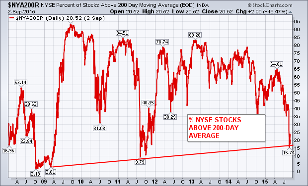
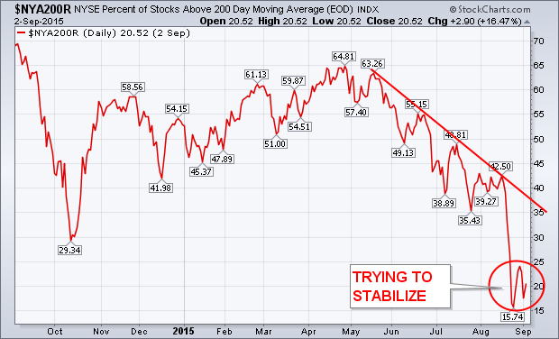
One of the warnings that I wrote about over the summer was the drop in the percent of NYSE stocks trading over their 200-day average. I pointed out over the summer (before the August plunge) that a stock market couldn't maintain an uptrend while two-thirds of its stocks were in downtrends (below their 200-day lines). Chart 1 is an updated version of those earlier charts, and carries good and bad news. First the good news. The red line has fallen below 20% which puts it in a major oversold condition. This is a logical spot for it to attempt a bottom. The bad news is that the red line is still in a downtrend. That has to change. Chart 2 shows the downtrend starting in late April from a +60% reading. Its been all downhill since then. To the bottom right, the line is starting to stabilize (red circle). That's encouraging. But it needs to more to signal a bottom. A good start would be a rise above its late August peak at 24%. A more convincing move would be above its early August high at 42%. It may take awhile for that to happen. But the bottoming process may have started.
Bonds are outperforming stocks as money flows into relative safety and shuns risk. Overall, relative strength in bonds reflects risk aversion in the financial markets. Relative strength in bonds also indicates that investors should prefer bonds over stocks right now. Like all market dynamics, it is subject to change, but current trends favor bonds until there is evidence to the contrary.
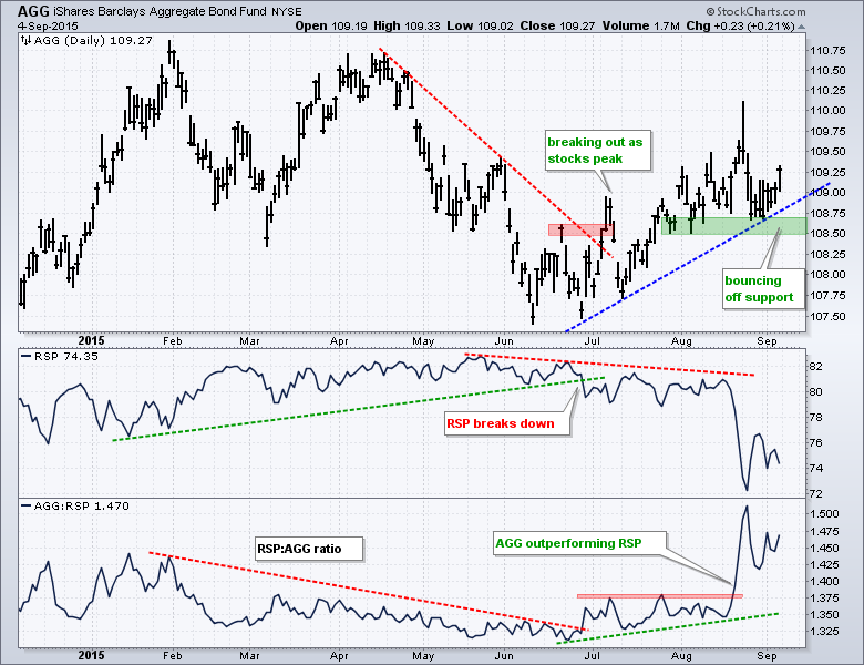
I am using the Aggregate Bond ETF (AGG) to represent the "bond" market and the Equal-Weight S&P 500 ETF (RSP) for the stock market benchmark. The chart shows AGG firming in the 107.5 area in June and breaking out in July. AGG extended its gains into August and established support in the 108.5-108.75 area. The ETF caught another bid this week with a bounce and this further affirms the support zone. The trend here is clearly up as long as support at 108.5 holds.
Click this image for a live chart
The middle window shows RSP and the lower window shows the AGG:RSP ratio. Notice that AGG broke out as RSP broke down in July. This indicates that money moved out of stocks and into bonds at pretty much the same time. Chartists can also compare the performance of bonds versus stocks using a ratio plot (AGG:RSP). This ratio rises when AGG outperforms RSP and falls when AGG underperforms RSP. Notice how this ratio surged in August as relative strength in AGG accelerated. Clearly, the financial markets prefer the safety of bonds right now. The next chart shows the 7-10 YR T-Bond ETF (IEF) with similar relative strength and the image underneath shows how to create a ratio chart.
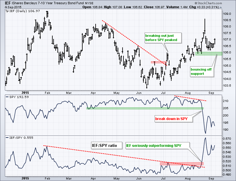
Click this image for a live chart

Click this image for a live chart
************************************************************
Thanks for tuning in and have a great weekend!
--Arthur Hill CMT
JAPAN SUCCUMBS TO GLOBAL WEAKNESS ($NIKK)
by Greg Schnell | The Canadian Technician
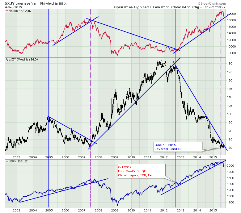
One of the areas I like to watch is the global arena. When the markets around the world are breaking down it can be a good warning signal for the US markets. Obviously, the big drop from the parabolic rise of the Shanghai market has been a concern globally. But I also like to watch Japan. As the third largest economy in the world and a highest level of debt to GDP, I like to keep an eye on this market. Currently the government program of Abenomics has involved a massive Quantitative Easing package. While this package usually attracts investors to the Japanese market, the dropping Yen has also been a part of the QE strategy. Recently both charts [the Yen ($XJY) and the ($NIKK)] have reversed direction which is the reason that it is timely to examine what is happening in Asia.
Let's look at the Yen first. In the centre of the chart below is the Japanese Yen ($XJY). The turning points in the Yen have been at major historical turning points for the overall equity market in Japan. The low in the Yen currently is the same as the low level in the Yen that occurred at the 2007 equity market top in the Nikkei ($NIKK) and the S&P 500. It is interesting to me that the Japanese market rolled over so strongly recently while the Yen looks like it is trying to rise above resistance.
The Yen looked different in some of the other major market tops in the Nikkei. The chart below shows the Nikkei top in 1990 and the chart ends in 2003. The $NIKK topped out at 38000 back in 1990. Since then the government has been fighting to restore the economic strength of Japan. The one year rally in the $NIKKEI after the Asian financial crisis was over 50% as shown on the chart so the flatness of the $NIKK chart should not be underrated. The Asian financial crisis in 1998 as well as the market top in 2000 had the Yen ($XJY) and the $NIKK move directionally together (which is different that the last 10 years shown above) and to some extent the low in 2003 was the same. All that to indicate some of the biggest turning points in the market were associated with big turning points in the Yen. The opposing direction was not always a condition.
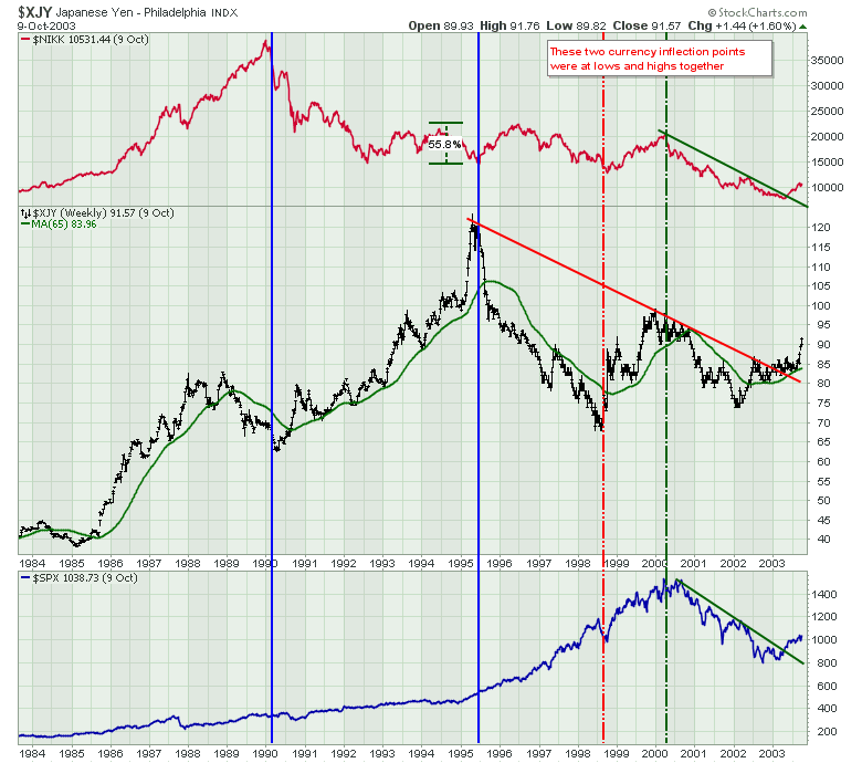
So I am very suspicious of a major top if the Yen continues to move higher. With trend lines broken all over the world, let's look at the Shanghai correlation. The chart below has the Shanghai ($SSEC) as a red area chart, the $SPX is shown in blue on top of the Shanghai chart and the CYB is the ETF that tracks the Chinese Yuan (CYB).
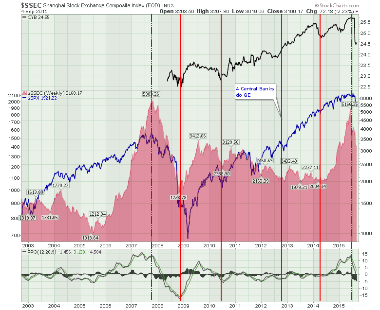
The break in the Shanghai in 2007 corresponded with a US market top. We don't have currency ETF information for the 2007 period but the current pattern shows a currency breakdown in China corresponding with a Shanghai stock market that has broken down more than 40% and it corresponds with major breaks in the US market and Japan.
In summary, the three major economies in the world are all moving lower together and we have one major currency trend change in the Yuan and it looks like the Yen is reversing. While the $USD is stuck in the middle of the 2015 trading range, it would appear this current period has all the makings of a major top in the 3 largest economies of the world. If it proves not to be a major top, this would appear to be a rare situation where all these correlations did not matter. In the fullness of time we will know but caution is definitely warranted. I think any weekly close above 0.865 on the Yen ($XJY) on Chart 1 would probably confirm the market condition.
Good trading,
Greg Schnell, CMT
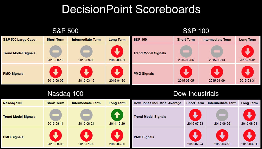
Take a look at the DecisionPoint Scoreboard for last week. (You'll find the Scoreboards in the DecisionPoint Chart Gallery. The link is on the homepage). If you've read any of my articles this week, you'll know that the new Long-Term Trend Model (LTTM) 50/200-EMA crossover SELL signals are a harbinger of doom (or at least have very bearish implications). Both the S&P 500 and S&P 100 joined the Dow Industrials with LTTM SELL signals this week.
The other attention getter right now is the DP Market/Sector Summary (found in the DP Reports Blog daily). The top table in that report displays our timing signals and intermediate-term postures for the top sectors and indexes. I find it interesting that right now the only "bullish" signal is on TLT.
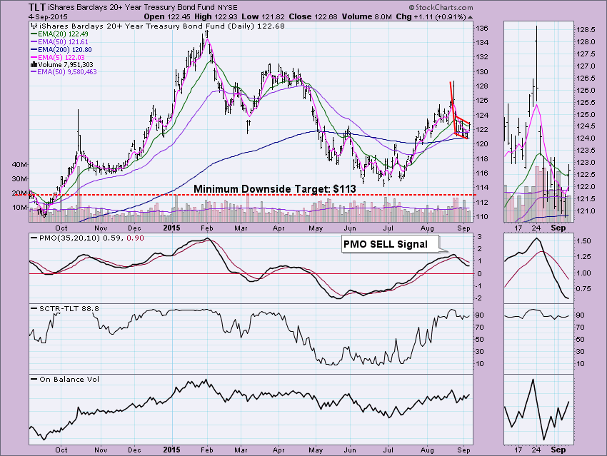
I wrote an article Thursday about TLT. It is far from a bullish set-up right now. Notice the bear flag and Price Momentum Oscillator (PMO) SELL signal. (For more analysis of TLT, check out my Thursday article in the DecisionPoint Blog here.)
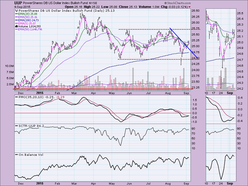
I thought about what would turn the current Neutral and SELL signals on the DP Market/Sector Summary to BUY signals. The DecisionPoint Intermediate-Term Trend Model (ITTM) BUY signals are generated by positive 20/50-EMA crossovers. I decided to scan the issues in the Market/Sector Summary to find which ones had rising 20-EMAs. There were only three. The dollar (UUP), oil (USO) and commodities (GSG). Does this mean they have internal strength?
UUP nearly had a Short-Term Trend Model (STTM) BUY signal generate today. The 5-EMA missed crossing the 20-EMA by a few tenths of a point. The dollar has been rising unenthusiastically this week, but it is rising. The PMO missed a BUY signal by thousandths of a point. In reality we can look at this as a BUY signal. Momentum is positive and price broke above the declining tops line. Yet overall it seems the dollar is still undecided. The PMO is leaning bullish.
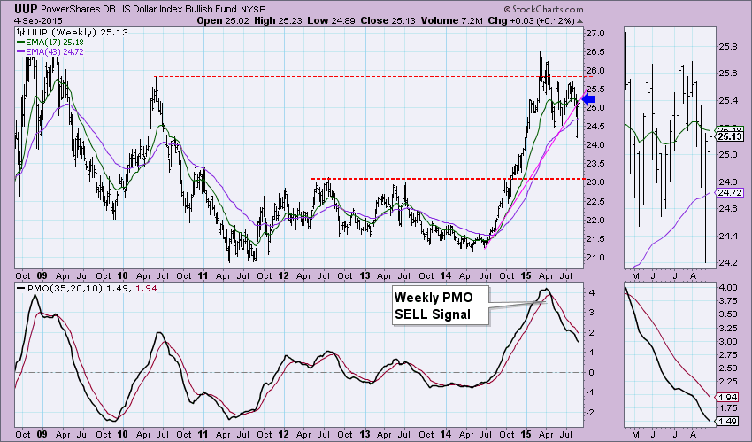
The weekly picture is bearish. Note the PMO is falling with no hesitation and we see that price was unable to break above the rising bottoms trend line. The daily chart is neutral to bullish (I'd consider it bullish when the ITTM BUY signal appears) and a bearish weekly chart leave me less than excited by the dollar's potential.
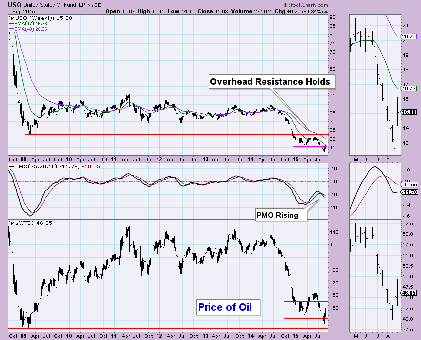
I've annotated bull flags on USO and Oil. I have not done an official calculation of the minimum upside targets, but a guesstimate is about $20.00. The PMO is looking good. Our posture in the intermediate and long terms is bearish, but a positive 20/50-EMA crossover would generate an ITTM BUY signal. USO has a big deficit to overcome to get that signal, but if this bull flag executes, it would be no problem to produce that signal.
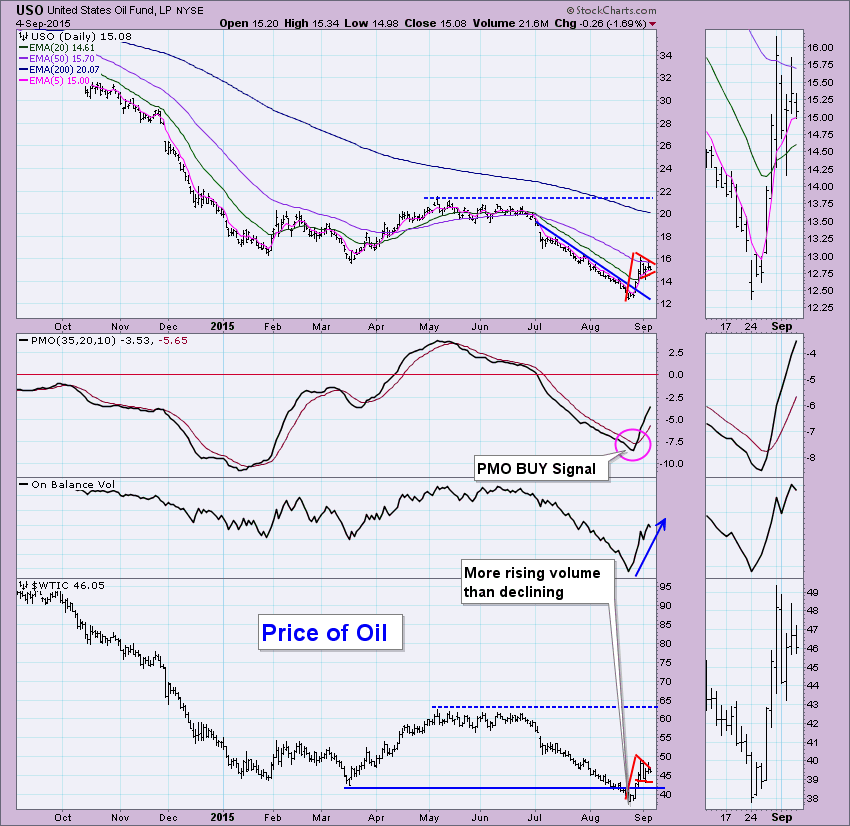
The weekly chart is improving somewhat. The weekly PMO is rising now. If you note the last PMO bottoms compared to the price bottoms, there is a positive divergence. Oil is holding well above long-term support at $30. I'd like to see USO close above resistance next week.
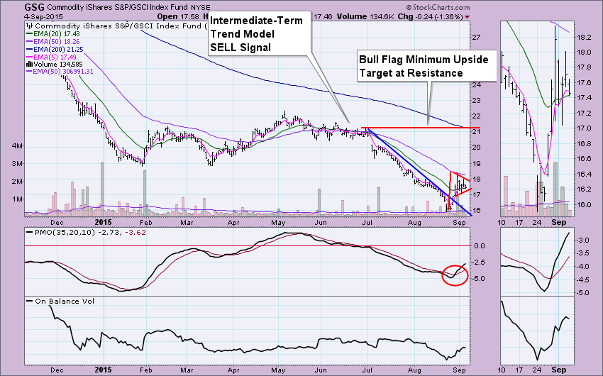
The final rising 20-EMA belongs to GSG, the Commodity ETF. Clearly the picture is very similar to that of Oil which is included in GSG. The bull flag and PMO crossover BUY signal is positive. I like that the OBV has been rising, suggesting that volume is higher on positive closes.
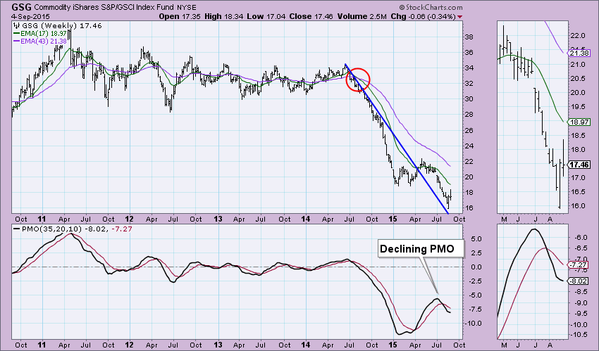
The weekly picture is neutral to bearish. Price is staying above the declining tops line, but the PMO is falling after a SELL signal and although it is decelerating, readings are well below zero which is bearish.
Conclusion: There are positive set-ups on these three ETFs in the shorter-term and our DP indicators are confirming that. The intermediate term is murky on the weekly charts. I discussed my findings with our resident commodities expert, Greg Schnell (author of the "Commodities Countdown" Blog) to get his "take". He explained that seasonality is positive for Oil right now but that he and others don't expect it to hold at $50 too much longer. We agree that the dollar is undecided. China is a big factor and Monday's trading should provide us some insight on what to expect Tuesday.
There are plenty of technical analysts calling for the beginning of a bear market after the past couple weeks of heavy volume selling. I'm certainly open to that possibility as I always respect price support breakdowns with accelerating volume. But the story behind the scenes isn't making a lot of sense and doesn't support that line of thinking. Typically, we see money flow away from aggressive sectors on a relative basis (vs. the benchmark S&P 500) before the plunge begins. The weakness recently, however, has been focused more on energy, materials and defensive groups, which is just plain odd. Bear markets can come in all shapes and sizes so I will definitely respect what's happened, but at the same time I will not be shocked if we magically resume the six year bull market once September is behind us. Compare how the aggressive sectors acted relative to the S&P 500 prior to the 2007 top to how they're acting now:
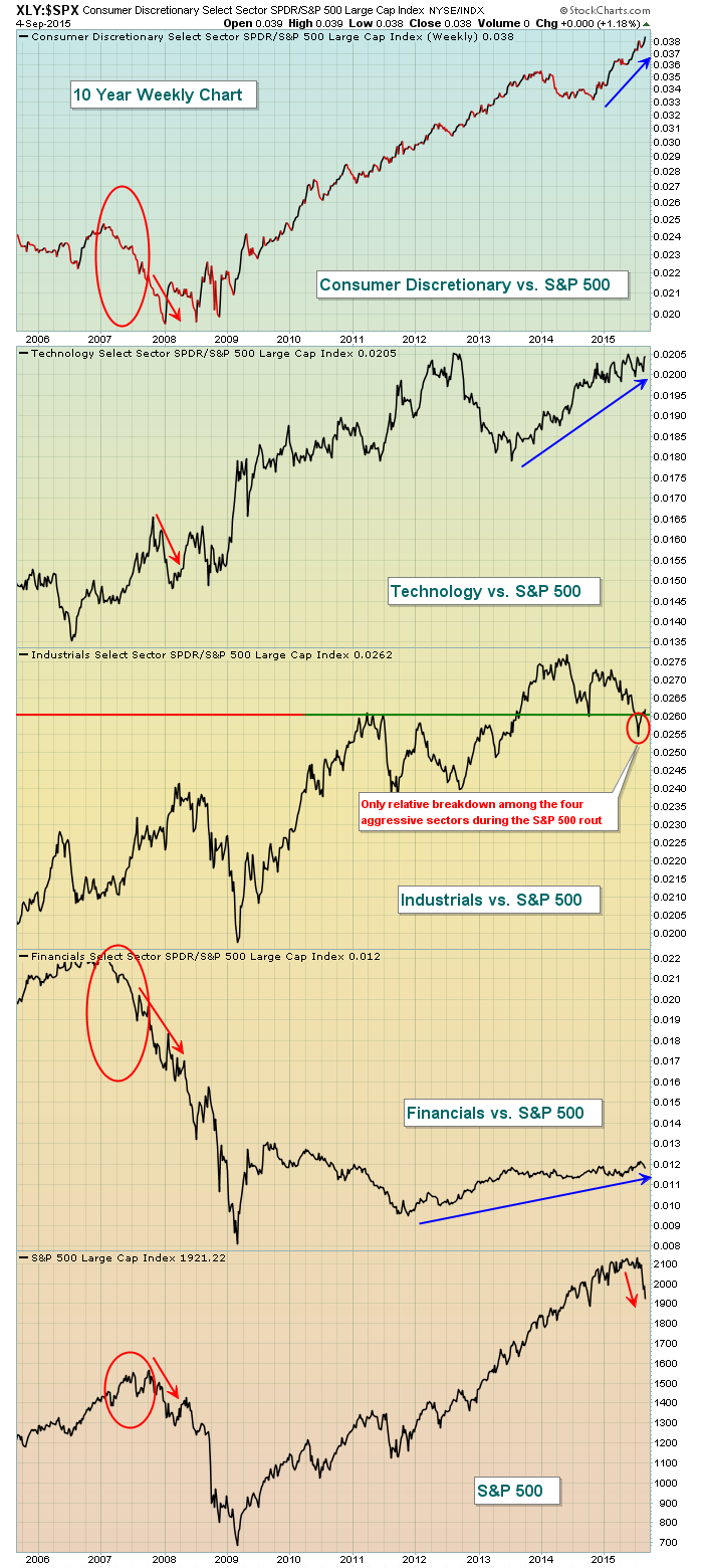
In 2007, both consumer discretionary and financials performed horribly BEFORE the S&P 500 topped. In other words, much of the smart money began rotating away from aggressive areas of the market prior to the recession that followed. And technology performed very poorly on a relative basis when the S&P 500 took its initial drop beginning in October 2007. Now fast forward to 2015 where we see consumer discretionary outperforming on a relative basis. The only true blemish with respect to the relative performance of aggressive sectors was a slight relative breakdown in industrials. A bear market generally tears apart aggressive areas of the market because those sectors are laden with high PE companies that typically free fall as PEs contract and GDP turns negative. The stock market always anticipates economic strength and/or weakness before it occurs.
But while the story behind the scenes doesn't make a lot of sense, I'm also watching our major indices and sectors struggle to clear rapidly-declining 20 day EMAs, a necessary first step to right this broken technical ship. Also, the Volatility Index (VIX) continues to print readings in the 20s and 30s two weeks after the initial selloff. During the brief V-bottom selling in October 2014, the VIX spiked above 30 but within just a few days retreated back to 15. On Friday, the VIX closed at 27.80 and reflects tremendous nervousness. Bears prey on fear and they've still got plenty to work with.
My conclusion is this. We COULD be in a transitional phase from bull market to bear market given the short-term high volume breakdowns. So until we begin to clear falling 20 day EMAs and the VIX settles back down below 20, I'll remain extremely cautious. I will be prepared, though, to become much more aggressive on the long side if the 6+ year bull market resumes.
Happy trading!
Tom
We've all heard that famous quote from Franklin D. Roosevelt in his first inaugural address. It's a saying that has had staying power for over 80 years. And it's something that rings true today in the current and volatile market environment.
It starts with the VIX which hit a level on August 24 that had not been seen since March, 2009, when the market was in tatters and bottomed. And even before that the VIX had skyrocketed to an historical high that might never be seen again.
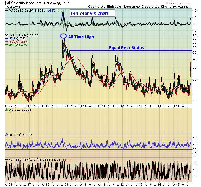
Whether or not this recent fear is warranted hardly matters. It is what it is. But it's worth examining some to see how the period we are in now stacks up to the environment back in the 2009 time period.
For those who rely on studying stock charts for a living like I do, the assumption is everything going on in the market is baked into the charts we look at. I buy into that theory. But sometimes under unusual circumstances like we've experienced recently you have to take an extra step back and think things through instead of relying on just one source.
For example, when the VIX was last in the 50's the S&P was at 666. When it hit that 50+ level recently the S&P held at 1867. Also, GDP was in negative territory back in 2009 with the unemployment rate peaking at 10%. The most recently revised GDP was over 3% with the unemployment rate now at 5.1%. What about housing? Back in 2009 the housing market had collapsed, foreclosures were rampant. Today? A completely different picture with strong recoveries in many pockets of the country. And, who could forget the TARP program, where $700 billion was funneled into banks so they wouldn't collapse. So really, there is no comparison between now and 2009. Yet traders are scared to death.
This is why it's time to put things in perspective, to stop worrying so much about the Fed raising rates, something that has dominated the headlines for a long time. If anything, a rate increase would take the mystery out of the equation. And this in turn could help get the market back on track. And if the Fed doesn't raise rates for a while? It won't be the end of the world.
I've decided to host a webinar this upcoming Tuesday, September 8, sometime after the market closes. During the webinar we'll look at some big names that are now on sale, stocks that traders could not get enough of just a few weeks back that no one wants to touch now. We'll also look at some companies that had strong earnings the last quarter and held up quite well during this recent bout of selling. If you're interested in attending this FREE event just shoot me an email to john@investedcentral.com and I will get back to you with the details..
At your service,
John Hopkins
President
Invested Central/EarningsBeats.Com

I'll show you mine, if you show me yours! What were you thinking? We are talking journals here. During periods of extreme market volatility – such as we presently have – no action can be the right action to achieve your long term goals. Understand that periodic corrections are to be expected and can actually work on your behalf if you continue making contributions to
Read More


 I'll show you mine, if you show me yours! What were you thinking? We are talking journals here. During periods of extreme market volatility – such as we presently have – no action can be the right action to achieve your long term goals. Understand that periodic corrections are to be expected and can actually work on your behalf if you continue making contributions to