Hello Fellow ChartWatchers!
Well, I don't know about you, but I'm impressed. Last week, the current rally moved higher and gained more momentum. After briefly (very briefly) pausing at its 200-day moving average, the Dow surged higher and obliterated the rounding-top concept I've talked about in the past. There is still lots of overhead resistance that can cause problems for this uptrend - especially around 17,750 - but so far there is no evidence that the market is paying attention to the past right now. Here's the final(!) version of my weekly Dow "rounding-top" chart:
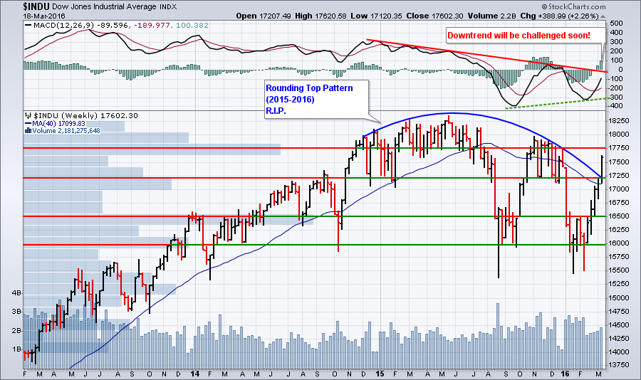 For those that haven't seen this chart before, the histogram bars sticking out from the left side of the chart are "Volume by Price" bars that show the total amount of volume that occurred whenever the stock closed within the vertical range of the histogram bar. The fact that the histogram bar containing 17,750 is much longer than its neighboring bars tells us that lots of volume has happened in the past near that level - and thus, 17,750 will probably act as a support/resistance level in the future.
Two other quick things to notice on this weekly chart - the MACD is still in negative territory although that might change soon and weekly volume continues to increase although it is still below January's levels.
There's No Such Thing as "Overbought"
(Or "oversold" for that matter.) The point of this admittedly controversial headline is that as technicians our primary goal is to find and ride trends. Let me say that again. Technical analysis' primary goal is to find stocks that are trending and then take advantage of that trend. Assuming you don't short things (please don't), then the only way to make money as an investor is to buy low and sell high - i.e., ride an uptrend.
Given that finding and riding uptrends is our primary mission, once you are riding an uptrend, why would you ever get off of it before it reverses? This is where the concept of "overbought" can work against you. Once a stock has moved up for any significant amount of time, there will be many technical indicators that will start to flash the "overbought" signal. This is very common with what are called "bounded oscillators" - indicators that have upper and lower value limits. Examples of bounded oscillators include the RSI oscillator and the various Stochastic oscillators.
There is an expression I like to remind myself of whenever I look at a chart with lots (too many) indicators:
"Oscillators oscillate."
This brilliant insight reminds me that many technical indicators go up and down frequently - even if the stock is continuing to move higher. They can't help it. They were designed to work that way. (In reality, they are meant to be used when a stock is moving sideways, not when it is in an uptrend.)
My point is this: Right now, because of the current strong rally, there are lots of stocks out there that are in "overbought territory." That expression implies that you shouldn't buy any of those stocks. That's bunk. As technicians, our job is to find and ride trends. Currently, the market is in a strong trend that is demanding to be ridden.
How? Ignore the oscillators and focus instead on momentum (MACD, PPO, PMO) and relative strength (SCTRs) - two things I have written about before. As long as momentum is increasing and the SCTR value isn't falling, ignore any "overbought" signals you may hear about. Strengthening momentum and strengthening relative strength are the key.
(And yes, even during this strong uptrend everyone should use solid risk management techniques like the ones found in Alexander Elder's eBook "Step-by-Step Trading.")
Uptrends do not get much stronger than what is currently on the charts. If you are not in this market right now, you need to do some soul searching and ask yourself the serious question "What else would it take for me to pull the trigger?" During last week's ChartWatchers webinar, I said that it was time for risk-takers to get in. At this point, there's very little left for this uptrend to prove.
Happy Easter everyone!
-- Chip
SITE NEWS
RECENT ADDITIONS TO STOCKCHARTS.COM
- CHARTCON 2016 DATES: SEPTEMBER 23rd AND 24th - This year we will be holding an on-line version of ChartCon in September. All your favorite StockCharts commentators in one place talking technicals for 2 days and the good news is that you don't have to travel to participate! That means the cost for attending ChartCon will be a fraction of what it has been in the past. We'll have much more details in the next newsletter - including sign-up information - but we wanted to let you know the dates as soon as possible so you can mark them on your calendar. Stay tuned...
- NEW "COGNATIVE BIASES" ARTICLE IN CHARTSCHOOL - Did you know that you may be losing lots of money due to your built-in cognative biases? Our new ChartSchool article breaks these down and helps you avoid the common investing mistakes they cause.
- UPDATED SHARPCHARTS VOYEUR PAGE - Check out charts created by other StockCharts users with our updated Voyeur page. Makes a great screensaver too!
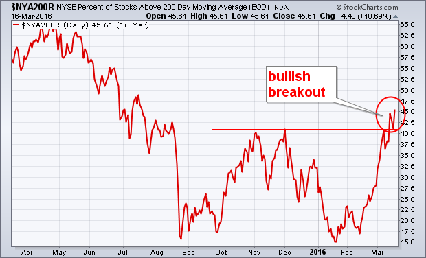
NYSE PERCENT OF STOCKS ABOVE 200-DAY MOVING AVERAGE TURNS UP... The previous Wedneday's message showed the % of NYSE stocks trading above their 200-day moving average moving up to challenge its fourth quarter high around 40% (after bottoming in January in oversold territory below 20%). Chart 9 shows the percentage figure having broken through that fourth quarter barrier to reach the highest level at 45% in eight months. That's a positive sign for the market. A further move above 50% would be even more positive.
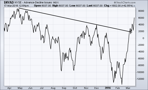
 NYSE ADVANCE-DECLINE LINE BREAKS OUT... The same message from last Wednesday showed the NYSE Advance-Decline Line moving up to test its fourth quarter high. Chart 10 shows the NYAD having broken through that fourth quarter peak to reach the highest level since last May (when the market itself started peaking). Last spring, the NYAD line led the market lower. Now, it's leading the market higher. That upside breakout also strengthens the view that the stock correction that started last May has ended, and that prices are headed higher.
- John
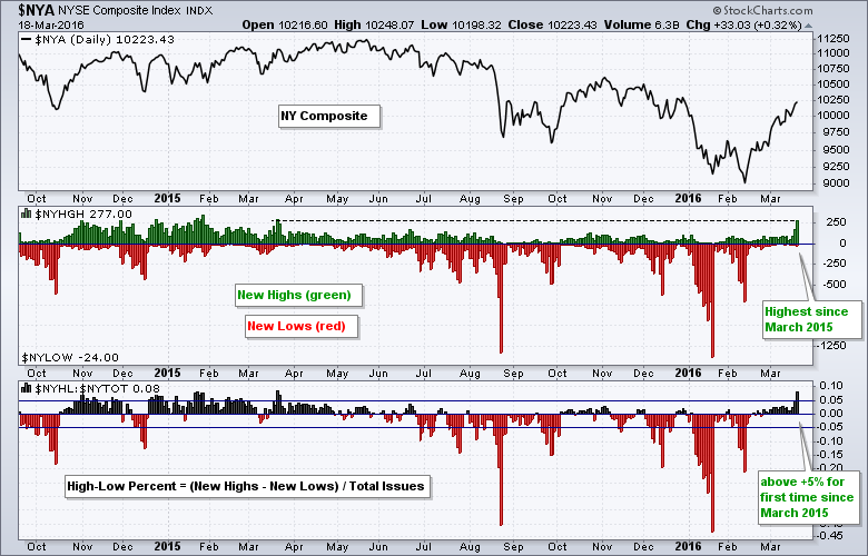
Two weeks ago I featured the NYSE McClellan Oscillator ($NYMO) and the Nasdaq McClellan Oscillator ($NAMO) as they surged to their highest levels in years. These breadth indicators are very broad and represent virtually all stocks traded in the US. Big moves in both breadth indicators signaled a bullish breadth thrust. Today, I am turning my attention to new highs for the NYSE and Nasdaq to see if strength is broadening. If you are looking for leaders, look no further than the new high list. Stocks hitting 52-week highs are in obvious uptrends and clearly leading the market.
The first chart shows new highs and new lows as an up-down pair. I will show an image with the SharpChart settings at the end of this commentary. NYSE New Highs ($NYHGH) exceeded 250 for the first time since March 2015. Also notice that High-Low Percent moved above +5% for the first time since March 2015. Thus, the rally is broadening within the NYSE as more stocks record new highs. Utilities, consumer staples, industrials and REITs accounted for most of the new highs.
The second chart shows the same indicators for the Nasdaq. First, notice that new highs are not as strong as on the NYSE and they are back near their December levels. Second, notice that High-Low Percent moved to +2% and remains well short of the +5% threshold. Nasdaq High-Low Percent has not been above +5% since June. Thus, the Nasdaq still has some work to do. New highs of note included 24 bank stocks, 15 industrial stocks and 10 semiconductor stocks.
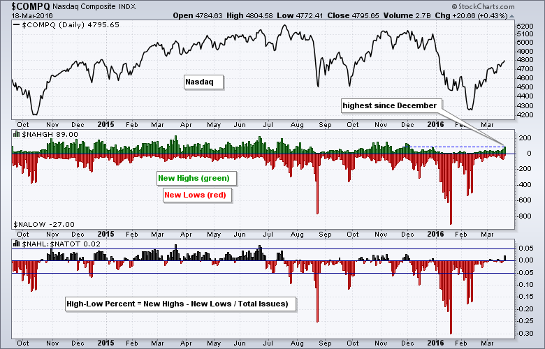 The image below shows the chart settings used to create this SharpChart. I selected "Price - Up/Down Pair" as an indicator and entered the high-low symbols in the parameters box ($NYHGH,$NYLOW). For High-Low Percent, I selected "Price" as the indicator and entered a ratio in the parameters box ($NAHL:$NATOT).
 ****************************************
Thanks for tuning in and have a good weekend!
--Arthur Hill CMT
Plan your Trade and Trade your Plan
*****************************************
HITTING IT LIKE A HAMMER ON A NAIL!
by Greg Schnell | The Canadian Technician
Industry breadth is usually helpful in finding a new breakout trend. What we mean by that is the number of stocks within an industry group that are breaking out together. When lots of stocks are moving higher in an industry group, rather than just one, it is a much better signal of opportunity.
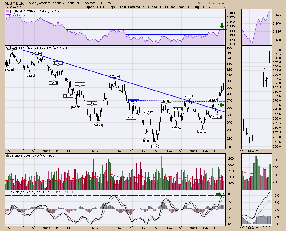
Looking at one specific chart that is looking great is $LUMBER. $LUMBER recently broke out to six-month relative strength highs in February, shown in purple. This week it made new 1-year highs. That strength attracts interest by portfolio managers. We can see the downsloping trendline in price broke around the 250 level which was close to the 200 DMA at $257 (not shown due to clutter!). This week, Lumber will close near a one-year high. A break above this level should send lumber related stocks higher.
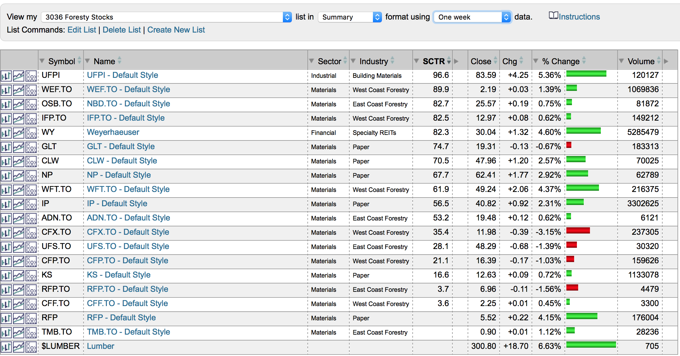
After seeing the $LUMBER move, I noticed some aggressive action in the forestry sector. Below is the %-change for one week. Some stocks had 5% moves this week. Currently, there are 5 of 17 stocks with an SCTR above 75. Not bad. GLT and CLW are just out of the top quartile.
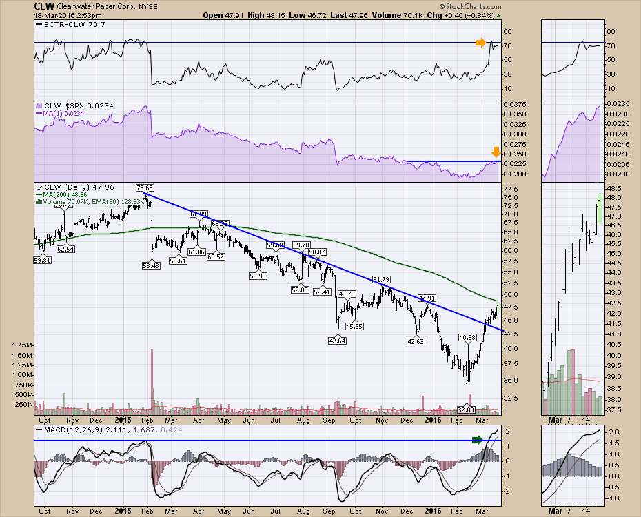
 I like the fact that a group of stocks are performing very well in response to the move in $LUMBER. One example of a nice chart is Clearwater Paper (CLW). The SCTR is just below my target entry zone of >75. The RS is very close to new 4 month highs, and the momentum on the MACD has surged to the highest level in 1.5 years. With the broken trend line, this is interesting here. If Lumber breaks above $303 and stays above, these individual stocks will probably continue the uptrend. I would encourage you to look at the stocks with the strongest SCTR rankings first on the list above. Early leaders can perform very well.
 You might want to take some time to look through the $LUMBER related stocks this weekend using the ticker listing on chart 2 above. There could be some opportunities sprouting. I also posted an article on Weyerhaeuser (WY) in Friday's Don't Ignore This Chart. Click on the link to see that one. I also talked about $LUMBER in the Commodities Countdown Webinar 20160317 on Thursday. I couldn't be more concerned about the broader markets, but there are industry groups that might still work out great. Lumber looks like it is trying to set up for a bull run here. Staying above $303 would be part of my thesis. You can click on the $LUMBER or the CLW chart in the future to see the updated chart.
I currently write on four different blogs within StockCharts. The Canadian Technician, Commodities Countdown, Don't Ignore This Chart, and the ChartWatchers newsletter. If you are missing some of the commentaries I refer to, it could be posted on different blogs. Sometimes different commodity articles are discussed on the Canadian blog as well as the Commodities Countdown blog as an example. Please register for each of them independently by clicking yes below the article. You can also follow me on twitter @schnellinvestor for trade ideas or thoughts about the market. You can also connect with me on LinkedIn.
Good trading,
Greg Schnell, CMT, MFTA.
HEALTHCARE SECTOR NOT SO HEALTHY
by Erin Heim | DecisionPoint.com
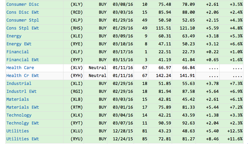
All of the sectors on the DecisionPoint Market Sector Summary are green with Intermediate-Term Trend Model BUY signals...except for Healthcare. As you can see from the excerpt of the report below, the current Neutral signal has been in effect for over two months. I decided it was time to investigate why and see if the Healthcare SPDR (XLV) was regaining its health as the other sectors have.
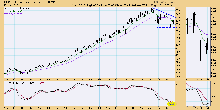
Looking at the longer-term picture on the weekly chart, the picture is not great. First, price was attempting to test resistance along the declining tops trendline and it failed to reach it. The pattern that is materializing is a bearish descending triangle. The expectation of this pattern is a break down below support. Looking from a distance, the Price Momentum Oscillator (PMO) looks bullish having bottomed in somewhat oversold territory. However, a closer look in the thumbnail reveals that the PMO has now turned down below the zero line and below its signal line which is very negative.
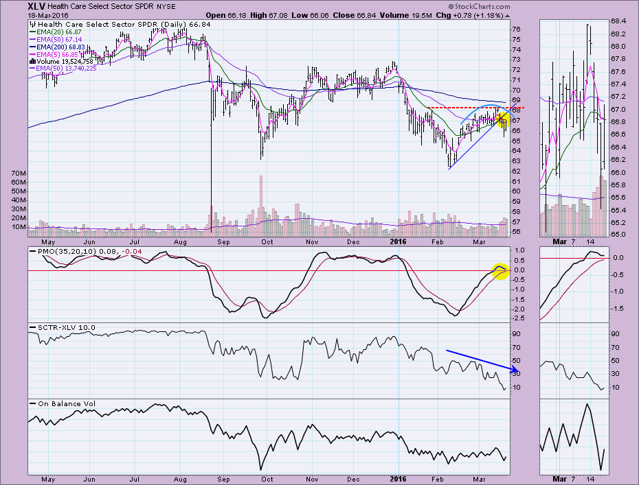
 A new Intermediate-Term BUY signal would turn XLV "green" on the DP Market/Sector Summary. An ITTM BUY signal is generated when the 20-EMA crosses above the 50-EMA. That will be very difficult given both EMAs are moving lower. Other problems with this chart are the bearish rounded top and the unsuccessful test of short-term overhead resistance; not to mention, the abysmal SCTR value. Internal weakness was already appearing as the SCTR trended lower during the last short-term rally. One positive is a PMO that is decelerating and could turn up before a negative crossover its signal line.
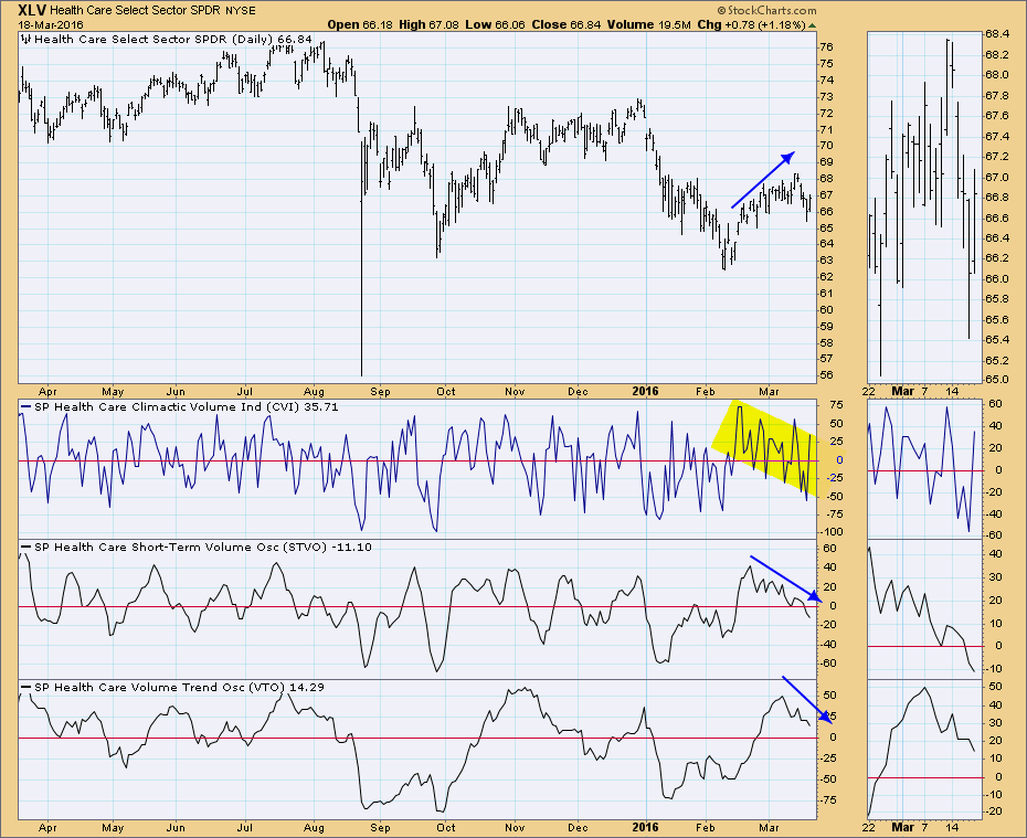
 The DecisionPoint On-Balance-Volume indicator suite shows negative divergences in all three time frames.
 Conclusion: It doesn't appear that the healthcare sector is recovering. It appears weaker.
Come check out the DecisionPoint Report with Erin Heim on Wednesdays and Fridays at 7:00p EST, a fast-paced 30-minute review of the current markets mid-week and week-end. The archives and registration links are on the Homepage under “What’s New”.
Technical Analysis is a windsock, not a crystal ball.
Happy Charting!
- Erin
Healthcare (XLV) has been the weakest sector over the past one and three month periods, but you'd never know it from looking at the Dow Jones U.S. Medical Supplies Index ($DJUSMS). The DJUSMS has gained over 8% during the past three months while the Dow Jones U.S. Biotechnology Index, for example, has tumbled 15% over the same three month period.
Medical supplies hit an all-time high one week ago, then last week fell back to test both price support and the rising 20 day EMA. Here's the chart:
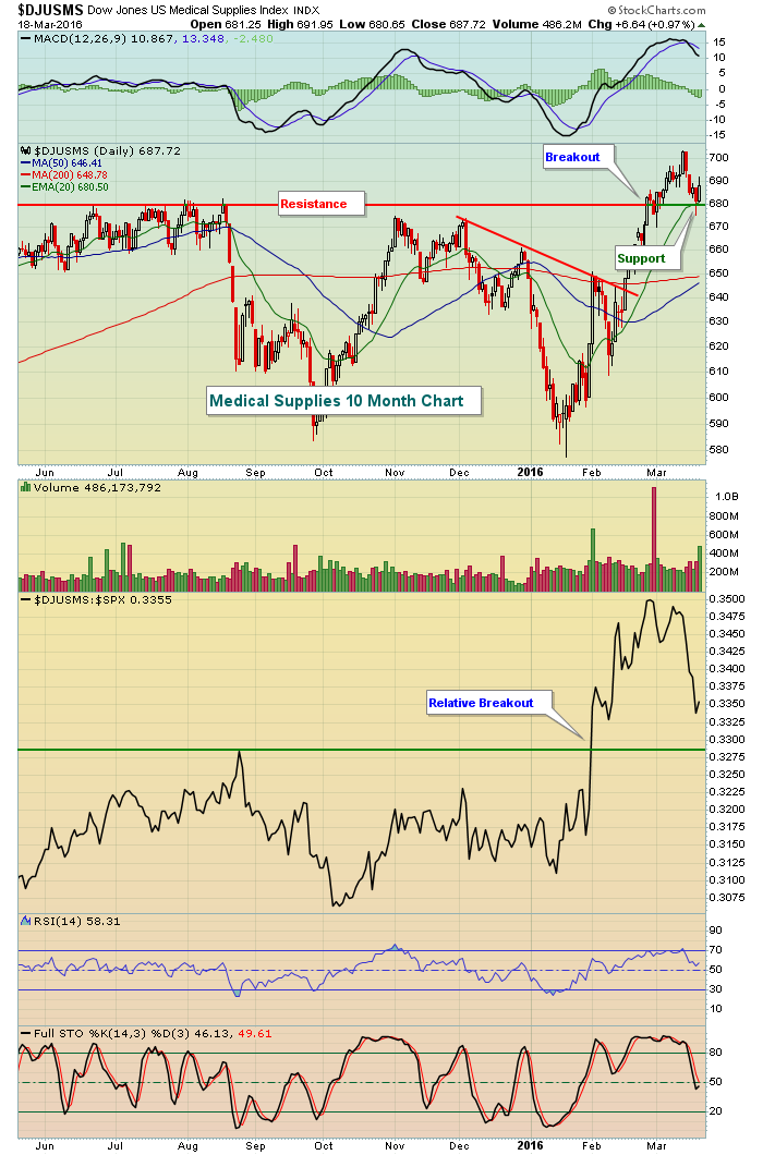 The daily MACD was pointing higher on the most recent price high, indicative of strengthening bullish momentum. That generally results in successful rising 20 day EMA tests and that's exactly what we saw on Friday.
Several individual stocks in the medical supplies industry look attractive. A few have broken out like the overall index, while others are just beginning to show signs of accumulation. Align Technology (ALGN) posted quarterly earnings results in January that topped Wall Street consensus estimates and the stock soared to test price resistance, but couldn't break through. After pulling back to test price support, ALGN recently saw strength that carried it through resistance. Some selling at the end of last week sent ALGN back down to test price support and its rising 20 day EMA. Check it out:
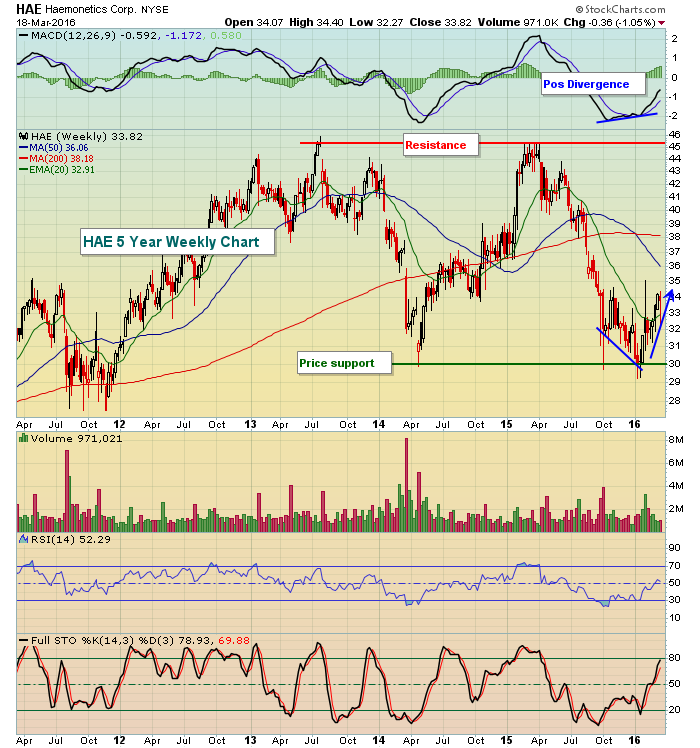
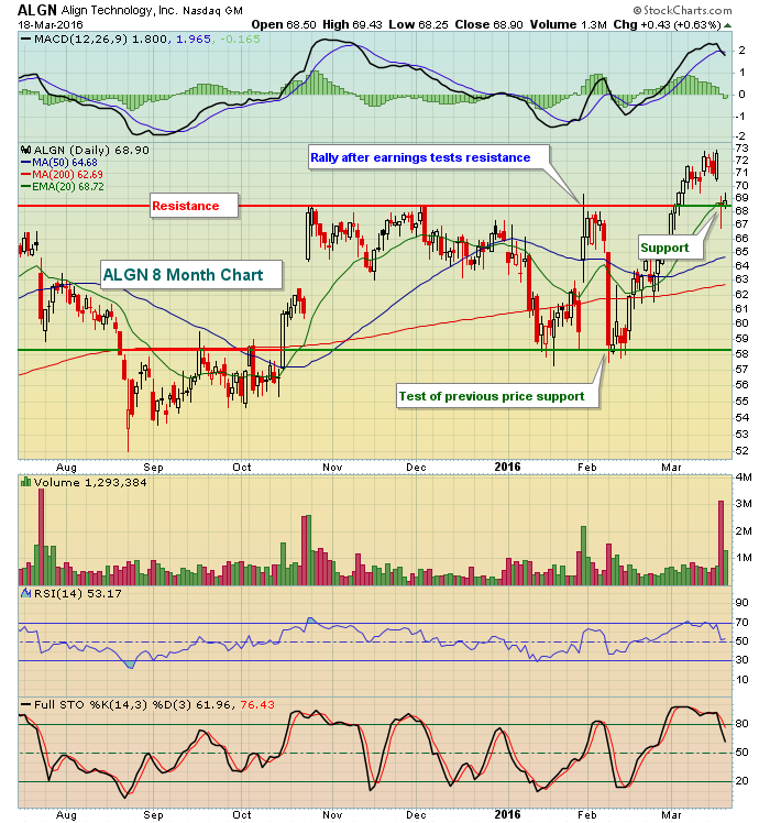 ALGN is a $5.49 billion company, but as you can see from the chart above, still remains a highly volatile stock. An even smaller stock that's beginning to show strength in this same industry is Haemonetics (HAE), which has a $1.72 billion market cap. HAE has just recently hit price support and has printed a positive divergence on its weekly MACD. That suggests it may have further room to run to the upside. Here is the latest technical picture on HAE:
 Happy trading!
Tom
InvestEd Central
John Hopkins is on hiatus this time. Please visit InvestEd Central for more articles by John Hopkins.

Whether it's life or investing, if you ignore the reality of correlations – be they positive or negative – you are literally engaged in paradigm shifting. This is the equivalent of trying to put the milk back into the cow. We all witness examples of positive correlations in our daily lives. The more it rains, the more umbrella sales go up. The more miles you run on the...
Read More For those that haven't seen this chart before, the histogram bars sticking out from the left side of the chart are "Volume by Price" bars that show the total amount of volume that occurred whenever the stock closed within the vertical range of the histogram bar. The fact that the histogram bar containing 17,750 is much longer than its neighboring bars tells us that lots of volume has happened in the past near that level - and thus, 17,750 will probably act as a support/resistance level in the future.

 NYSE ADVANCE-DECLINE LINE BREAKS OUT... The same message from last Wednesday showed the NYSE Advance-Decline Line moving up to test its fourth quarter high. Chart 10 shows the NYAD having broken through that fourth quarter peak to reach the highest level since last May (when the market itself started peaking). Last spring, the NYAD line led the market lower. Now, it's leading the market higher. That upside breakout also strengthens the view that the stock correction that started last May has ended, and that prices are headed higher.


 I like the fact that a group of stocks are performing very well in response to the move in $LUMBER. One example of a nice chart is Clearwater Paper (CLW). The SCTR is just below my target entry zone of >75. The RS is very close to new 4 month highs, and the momentum on the MACD has surged to the highest level in 1.5 years. With the broken trend line, this is interesting here. If Lumber breaks above $303 and stays above, these individual stocks will probably continue the uptrend. I would encourage you to look at the stocks with the strongest SCTR rankings first on the list above. Early leaders can perform very well.


 Whether it's life or investing, if you ignore the reality of correlations – be they positive or negative – you are literally engaged in paradigm shifting. This is the equivalent of trying to put the milk back into the cow. We all witness examples of positive correlations in our daily lives. The more it rains, the more umbrella sales go up. The more miles you run on the...