Hello Fellow ChartWatchers!
While the major averages were mixed last week with the Nasdaq up 0.5% and the Dow down 0.5%, in general the markets continued to weaken. Check out the Bullish Percent Index chart for the Nasdaq Composite:
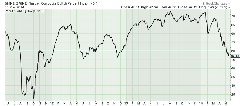
It has continued to move lower even after crossing the 50% line. That doesn't bode well for Nasdaq stocks. For more, skip down to John, Arthur, Greg and Tom's articles. I, on the other hand, want to talk about something that is increasing in value...
All the New Things at StockCharts.com This Year
As long-time members know, we are constantly increasing the value of a StockCharts.com membership without increasing the price. The first half of this year has proved that point in dramatic fashion. Here's a (mostly) complete list of all the things you now have access to on StockCharts, that you didn't have on January 1st:
(The ones marked with an asterisk are brand new features added within the last 2 weeks.)
All of these items have been added to the site since January 1st without any changes to our pricing. Think about that for a second. What other web site or software service do you know of that has continually added new features at this same rate? Our philosophy is that we always want to be increasing the VALUE of your StockCharts.com membership. We have consistantly demonstrated that throughout our history - which goes back over 15 years now - however this recent stretch of 4.5 months may have seen our biggest rate of functionality improvements ever. And we're aren't stopping now - look for another new, major charting tool to be added to our website in the coming weeks as well as two new exciting bloggers and much more.
And, no, all you cynics out there, there are currently no plans to change our pricing for the foreseeable future.
Enjoy!
- Chip
SITE NEWS
RECENT ADDITIONS TO STOCKCHARTS.COM
- Martin Pring's New Market RoundUp Blog Debuts This Week - StockCharts members can now read Martin's market commentary exclusively on StockCharts.com. Click here to see Martin's first sample article about the Japanese Yen. And click here for an article about Martin's new indicator, the "Special K"
- Early Registration for ChartCon2014 Ends on June 1st! - Register today and save $100 off the regular registration fee. Click here for details.
- "Difference Symbols" Now Available - Join two ticker symbols together with a minus sign ("-") and we will chart their difference on your chart. Click here for an example.
- DecisionPoint Chart Books Now Available as well - One of the last parts of the DecisionPoint.com website to move over to StockCharts are the DP Tracker Chart Books. They are now available via links on the right side of the DP Trackers blog area.
While U.S. stocks are starting to struggle on fears of high valuation, some money is starting to flow into foreign stocks that show better value. The chart below shows the S&P 500 doing better than foreign developed and emerging markets since the October 2011 bottom. During that time span, the S&P 500 (representing the U.S.) gained 65% versus a 54% gain in the EAFE Index (representing developed markets in Europe, Australasia and the Far East). The worst performer by far have been Emerging Market iShares which gained only 28%. Given the historic tendencies for global stocks to be more highly correlated, the unusual disparity between global markets is likely to correct itself. That process may have already started. During the first four and half months of 2014, emerging markets have been the strongest performers and the U.S. the weakest. The EEM has gained 2.7% versus 2% for the EAFA and 1.6% for the SPX. Expectations for more aggressive easing in the eurozone (which might eventually include quantitative easing) should provide a tailwind for European equities -- at the same time that the Fed is winding down its bond buying program. My main interest today, however, is emerging markets. Not only are they starting to show better relative performance, but their chart patterns look more promising.
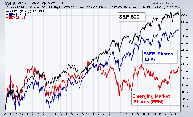
Chart 1
Take care,
John
(P.S. Click here for a bonus article from John from last Wednesday.)
ANOTHER WEDGE WORTH WATCHING
by Arthur Hill | Art's Charts
As noted in ChartWatchers two weeks ago, rising wedges are appearing on some key charts and chartists should watch these closely for directional clues. Even though the rising wedge can be a bearish continuation pattern, keep in mind that the immediate trend is up as long as the wedge rises. We should respect this uptrend until proven otherwise. A break below wedge support would reverse this immediate uptrend and signal a continuation of the prior decline. A move below the prior low is then expected and chartists can use the measured move technique for targets. Measure the distance of the prior decline and then subtract this distance from the high of the wedge. The distance can be measured as a percentage move or in points. The image below shows where to find the Percent Change Tool when annotating a SharpChart. It is behind the support-resistance line icon.
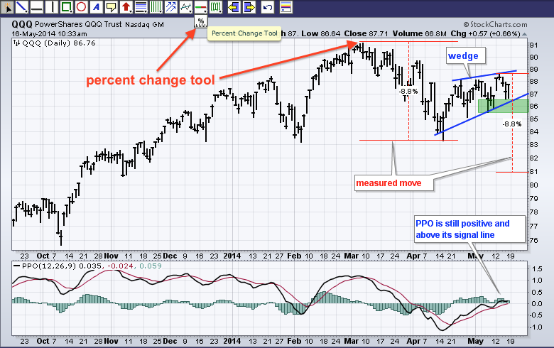
The chart above shows the Nasdaq 100 ETF (QQQ) rising within a wedge the last five weeks. The immediate trend is up as long as the green support zone holds. A break below the green support zone would reverse this five week uptrend and signal a continuation of the March-April decline, which was 8.8%. Using the measured move technique, an 8.8% decline from the wedge high would extend to the 81 area. The indicator window shows the Percentage Price Oscillator (PPO) just above the zero line and just above its signal line, which keeps it in bull mode. A break below the signal line would turn short-term momentum bearish. Note that there are also rising wedges forming in the S&P MidCap SPDR (MDY), the Finance SPDR (XLF), the Consumer Discretionary SPDR (XLY) and Nasdaq 100 Equal-Weight ETF (QQEW).
Good weekend and good trading!
Arthur Hill CMT
$LUMBER is a rarely watched indicator relative to $COPPER, $GOLD, and $WTIC. But Lumber is a valuable signalling tool.
Let's pull up the long term chart and discuss why. I want to spend a minute on the RSI because this chart is a classic with respect to Constance Browns work on the RSI. First of all Ms. Brown discovered that Bull markets oscillate between 40 and 90 and Bear markets oscillate between 10 and 65. Starting on the left, during the entire downtrend in 2006, 2007 and 2008, the RSI stayed in bear territory as shown by the Red line. After climbing above 40 in April of 2009, the RSI pushed up into bull market territory in November 2009. The trend had changed. Oops, the flash crash of 2010 in the equity markets sent $LUMBER into a tail spin. The RSI fell below 40 marking a potential bear market again. At point "A", that bear market signal was cancelled by the RSI returning to 70. The RSI stayed in the green bull mode until May 2013. Then it went down and touched 30. This was a significant warning that things could be changing. On the next rally, the RSI was unable to thrust back up into bull market territory and stalled at 60. Recently it was unable to get back above 50 which is very bearish. Even in the bear market rallies of 2007 and 2008 in the midst of the Sub Prime crisis, the rallies pushed up to 60. So the RSI points to a bear market rally in the fourth quarter of 2013. It could break higher and become a new bull market, but it makes us acutely aware now that two of the conditions have been met. 1) a trip below the 40 level in June of 2013. 2) A Failure to get back above the 65 level.
Let's look at the price chart. In 2006, $LUMBER was declining long before the market top. The lower highs and lower lows of the lumber price into July 2007 was a real confirmation of what we just covered on the RSI. While the RSI had the cap of 60 on it through 2006, 2007 and 2008, the Lumber price kept moving in a down trend with lower highs and lower lows. The March 2009 lows in Lumber were higher than the January 2009 lows. Easy to look back and know that March 2009 was the bottom. At the time it was pretty unnerving. Once the 2009 lows were in, lumber made a series of rising lows. The 2010 low was extremely 'V' shaped. The 2011 market crushed commodities in general in the March 2011 timeframe. Lumber plummeted but based at a much higher low. It made a 9 month base and powered higher. In October 2012, after the Fed launched the $85 billion per month QE, lumber soared to new highs. In the October / December 2013 time frame, lumber made a lower high. This was after the RSI had dropped all the way to 30 on the recent low so there was a warning. Now the price sits at the up sloping trend line as well as 7 years of horizontal support/resistance. This is an extremely critical place on the chart and the RSI suggests the highs are already in. Lets look at the PPO now.
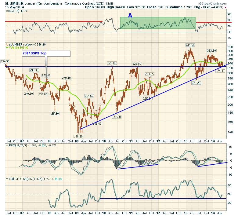
The PPO is just below zero and this is similar to how it based back in 2011. It really needs to find some strength here. The PPO is like the MACD but uses percentage to neutralize the change in price on the long term chart. So the only signal PPO is giving us is that it has fallen below zero. The pattern is similar to October 2007 and June 2011 with a lower previous low and now trying to make a higher low. In 2007 it failed at the zero line around December 2007 and started a series of lower lows.
The Long interval full stochastics are good for major trends. We can see that since the bull market started the 35-40 level has held. Recently we bounced off it again. That looks bullish. We need to see these long term levels break out to higher highs.
In almost every year, the $LUMBER price was in a downtrend for April May. The seasonality chart shows $LUMBER closed higher than it opened the month of May only once in five years (20%) in a big bull market.
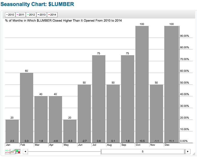
To conclude, the big picture looks damaged but not irreversible here. If lumber can find support at the trend lines and continue higher, it just makes both of those trend lines more important for the future. Should they both fail to support lumber, we would have a very important clue that bigger problems are starting to show up in the home construction industry and probably the broader economy. Lumber declines were very early in 2006 and 2007 relative to the equity markets. We are now holding some clues from 2013 and the first half of 2014. We'll need to see this turn signifcantly higher soon to take our worries away. If it does turn up, we might see the homebuilders make a push up as well.
Good trading,
Greg Schnell, CMT
Our focus is so often on the short term, but an awareness of what is happening longer-term is essential to getting a complete sense of market condition. One useful long-term indicator is what we call the 1% EMA of the Advance-Decline Ratio. I first learned of this indicator from Stan Weinstein's 1989 book, Secrets for Profiting in Bull and Bear Markets. He used a 200-day simple moving average of net breadth and called it the Momentum Indicator. When I started tracking it, I found it much easier to use an 0.01 exponential average (200-SMA equivalent).
Simple buy and sell signals are generated when the 1% Index (the choppy amber line) crosses above and below the zero line, but you can see it is pretty active and not so useful in that regard. Several weeks ago I was looking at it and decided to try a 50EMA (the black line overlay) of the index. That makes a lot more sense, actually conveys information more clearly, and while there are still some false signals, it is much more stable. While 50EMA zero line crossovers are clear declarations that momentum has shifted, I think that overbought tops and oversold bottoms give us a head start on looking for price to begin a change in direction.
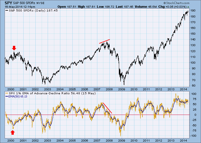
Let's look at three features that stand out. First, on the far left of the chart as the market was making the 2000 bull market top, the 50EMA was already well below the zero line. This was because participation in the bull market had been narrowed to only large-cap stocks, and breath and price were completely out of gear. This is an example of why I consider breadth-based indicators to be secondary to price-based indicators. At any rate, it was certainly confusing, but we could see that there was something seriously wrong with the market at that time.
Next, there was that classic negative divergence at the 2007 top, which was eventually followed by a timely cross down through the zero line. This was about as close to 'textbook' as it could be.
Finally, there is the current configuration with the 50EMA hovering near its highest levels ever. It shows that participation in the rally is vast and confirms what price is doing, but it can't last forever. What I will be looking for at this point is for the 50EMA to break down below about +50. I'm not saying that it is necessarily going to happen soon, but, when it does, it will be an early warning of internal weakness, or even a confirmation of a price correction.
-- Carl Swenlin
(P.S. Click here for a bonus DecisionPoint article from Erin Heim that tells you everything you need to know about the new DP Trackers area.)
I've been very cautious about the stock market throughout most of 2014. There are warning signs galore. But the Russell 2000 has been hit particularly hard year-to-date, dropping approximately 10% from the high set in early March. That was the time when money began rotating away from many of the momentum names and traders turned from "risk on" to "risk off" mode. Many small cap stocks have taken the brunt of the selling. The short-term news isn't great as a bearish head & shoulders top is in place and the upcoming week is quite bearish historically for small caps. Next week has produced annualized returns on the Russell 2000 of MINUS 17.04%. That's the bad news. The good news is that overall May is one of the best calendar months of the year for the Russell 2000 and late May/early June tends to be VERY bullish historically. From the May 25th close through the June 5th close, the Russell 2000 enjoys annualized returns of 66.20%, one of the best historical periods of the year for the aggressive and highly volatile small cap group.
So the first question becomes "can the Russell 2000 hold onto neckline support in the near-term to enable the bulls to do what they do best - namely carry prices higher from late May into early June?'. Check out the bearish head & shoulders pattern and the relative weakness since March:
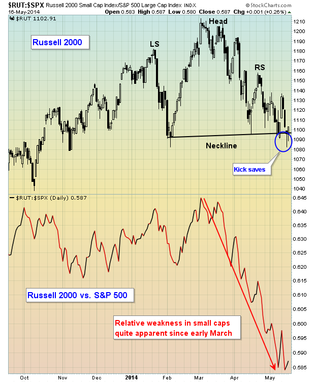
If the Russell 2000 breaks down this week, we have to respect it. But after this week, the tendency is to see bullishness and relative strength from small caps and that could set up a number of opportunities. Truckers have been a source of industry strength of late and there's a small cap trucking company that provides a very solid reward to risk entry point at its current price. This stock is being featured as my Chart of the Day for Monday, May 19th. CLICK HERE for more details.

During my investment life, I've attended well over 100 different conferences and seminars. The Chartered Financial Analysts four-day event in Seattle last week was the 'gold standard'. With over 1800 attendees, the CFA Institute brought together a stellar collection of speakers, including my former professor, William F. Sharpe, a Nobel Laureate in Economics. There were far too...
Read More


 During my investment life, I've attended well over 100 different conferences and seminars. The Chartered Financial Analysts four-day event in Seattle last week was the 'gold standard'. With over 1800 attendees, the CFA Institute brought together a stellar collection of speakers, including my former professor, William F. Sharpe, a Nobel Laureate in Economics. There were far too...